Tag Archives: Digital Signage

The (Interactive) Experience that is Great Wolf Lodge, Pt. 2

Great Wolf Lodge

Yesterday, I wrote my initial post on the technology I experienced at Great Wolf Lodge. Today, after talking with the head of IT, I’m able to give more detailed information and insight on the operation. Thanks to Keith for meeting with me this morning. Here’s what I learned:

1. The technology in the wand is NOT RFID. It behaves a lot like RFID, but it’s a proprietary technology that includes infrared and a chip. The chip is programmed to the user and keeps an ongoing history of the user, not the wand. This is important because if someone loses their wand, they can easily get a replacement and have it re-programmed to their user history. According to my discussion this morning, the primary reason that RFID was not used in the wand was proximity. The game-makers wanted the wand to work within proximity, not through touch. Infrared has a wider range than RFID.

The technology here isn’t important. What is important is what the technology enables – a personalized experience that continually drives you deeper into the brand (in this case, the game). This particular technology is smart enough to keep a running history of personal achievement. That’s cool. And that’s the power of what any sort of interactivity provides in this blank canvas called Out-of-Home.

2. Active RFID is a whole different ballgame than passive RFID. All of the RFID that I experienced at Great Wolf Lodge is passive RFID. In yesterday’s post, you can see how powerful it is. Active RFID enables some cool things in this environment, particularly around tracking and safety. If those wristbands were active RFID, they would essentially become tracking beacons that could show where anyone was on the property at any given time. At a resort like this, can you imagine how easy it would be to find a lost child or a lost parent? It has a lot of advantages and it’s something that GWL continues to explore. Thing is, active RFID requires large antennas to pick up the signals. So, you can imagine what kind of operational challenges this presents.Being a theme-park, they have options. Turn them into large trees? It could happen.

3. They are always looking to innovate. But they don’t want to add something on that doesn’t utilize the existing technology. They want to make sure it works with what’s already going on. I was glad to hear that they are constantly looking for ways to innovate, but this whole thing didn’t surprise me. A large business like this would be foolish to not filter additional technology through what they’ve already got. And for GWL, who purposefully wants to provide an unparalleled level of convenience to their guests, they don’t want to risk complicating the experience by latching on to the latest, greatest.

4. Digital signage is not important to them. There are posters everywhere. They line the hallways. They’re in the usual places like elevators, the lobby, and the waterpark. I think digital signage could help in some places – menu boards or waiting in lines (for rides) – but other than that, I don’t think it makes sense. GWL is obviously a closed-in space, so they don’t advertise anything other than what’s going on in their own house. What they have now – lots of static posters – is just fine for them. I think if they felt confident in a way they could use digital signs with their existing technology, and it added a tremendous difference in value to what they already have – they’d explore it even more.

All of this technology and the entire experience it enabled just inspires me even more about the potential of creating solutions outside of the home. There are many ways to achieve different levels of interactivity, but the interactivity is the thing. It can make experiences easier, or better, or more convenient, or more fun. Thing is – it’s an experience.

And if you’re into this sort of thing, you can find one at Great Wolf Lodge.

Mobile Alters the (D)OOH Landscape Again

11th Screen | The Interactive Out-of-Home Blog

It’s crazy to think that mobile will not have a profound impact on the digital signage industry and even more, the channel that is out-of-home (OOH). Mobile alters it to the point where those static displays – be them digital or print – instantly become interactive. Through SMS short codes or image/code recognition or GPS. Or a host of other enabling technologies. Every day, it seems like someone is coming up with another way to use mobile devices to power more meaningful, deeper experiences. For the purpose of connection. Or convenience. Or entertainment. Or as we’re seeing more and more with brands and marketers, to conduct business.

Yesterday, Pepsi announced an interesting test program using one of these new, enabling technologies – “audio fingerprinting,” which is basically audio recognition. It works through an app on a mobile device (phone or tablet) and when it’s “on” (listening to audio coming from another screen), it can recognize the programming and take action on it. Earlier in the year, Grey’s Anatomy used a similar technology that allowed people who were watching Grey’s Anatomy and using the Grey’s Anatomy app to have an interactive, customized experience on their mobile device. It recognized what episode you were watching and then served up engaging content – polls, quizzes, cast videos, etc… – relative to that particular episode. Just by “listening” to the program.

Well, here, Pepsi is doing the same thing. But instead of serving up additional content, they’re serving up a coupon (for a free Pepsi Max). When the mobile device hears this Pepsi commercial, it rewards you for watching it by giving you a coupon.

The implications of this sort of technology on a “static” (push-only) digital sign are huge. This now enables any of that boring, one-way content to a) become interactive and most importantly, b) not have to be altered. The mobile device actually takes care of everything.

Yes, this is another example of how mobile can dramatically change all those digital screens, but on a bigger scale, this is another example of how those places and things around us are being turned on and instantly connecting us with each other and the brands we love.


Jerry’s World and the Eensy-Weensy Touch Screen

I don’t know if there’s a single venue in the world that is more digitally turned on than the new Cowboys Stadium, er Jerry’s World. I was there last night for a concert. On our way, my wife asked me, “what are you most excited about – the concert or seeing the stadium?” I smiled. “Both,” I said. Nirvana.

You’d have to be living under a rock to not know about the JerryTron – the world’s largest high-definition display. Or the countless other displays and flashing lights that make it a mini Times Square capsule. Plopped right down in the middle of north Texas. It lives up to its hype, for sure. Especially for someone who notices and appreciates all of this digitalness.

But for all of the technology inside, I was initially surprised by the lack of interactive technology. I walked the entire stadium and while we didn’t explore every level, we got a good feel of all of the different kids of displays. And found only 1 example of interactive technology. This eensy-weensy touch screen in one of the Pro Shops (it was cordoned off last night):

Cowboys touch screen

It lets you make a personalized jersey. Quite appropriate and engaging, especially in the middle of a football game when the entire Pro Shop is filled with consumers. I can only assume this takes a little bit of the load off of the sales representatives and the consumers. Even if there’s only 1?!@?

Every other place I looked, I couldn’t find anything else that I could actually interact with. How could this be? Really, Jerry?

Then, I saw the drunk people. One after another, walking through the concourse. Stumbling in some cases. And I understood what kind of disaster anything highly interactive would be.

I think this is a great example of the importance of context.

Interactivity would, no doubt, enable some better experiences. Any time you can give people control of their own experience through technology, be it waiting in line, purchasing something, or consuming content, it’s generally the ideal to strive for. But when alcohol is present and alcohol – not any sort of technology – tends to be the primary element that enhances the experience, then I don’t necessarily think it’s such a great idea. Abuse. Grime. Who knows what else.

On the consumer/fan side – anyone in that state of mind and environment could probably care less about controlling their experience through any sort of technology like a touch screen. In fact, it might have the opposite affect on their experience –  it might be more challenging and/or frustrating. They’re just there to have a good time. It’s that simple. So, why do anything that a) could hamper that experience and/or b) is not really needed?

While it’s a simple point of context, I think it’s one that shouldn’t ever be overlooked. Alcohol is the X-factor. In many areas. Even in digital/interactive signage.

So, OK, I see – Jerry did it right again. The the smart solution is to provide 1 eensy-weensy touch screen in a cordoned off area of Technopolis. Nothing more.

Note – Now, interactivity through mobile phones is a completely different story, regardless of alcohol. Everyone was doing something on their mobile phone at some point during the concert. And most everyone I saw had a smartphone. (I didn’t pay close attention, but I certainly didn’t see any flip phones and I saw a lot of iPhones). Opening the digital displays up to user-generated content through their phones might not be the answer. But I think there is opportunity to engage consumers/fans in some way that enables interaction instead of just display. That’s for another post.

Another note – I’m not passing any judgement and/or making any assumptions about anyone’s ability to function with alcohol. This is based on personal experience and observation. Just saying….


The Evolution of OOH – Pt. 2

In my new exploration to try to find the 3.0 versions of OOH executions, I don’t think I’m going to have to search hard. They seem to be popping up every single day. The problem is in their scale. They’re typically one-off, experimental examples. Nonetheless, they deserve attention. This time, a billboard:

The 1.0 version

Billboards for Everyone 1.0

And the 3.0 version

Billboards for Everyone 3.0

An augmented-reality, GPS-based personal billboard that can be shared with your own social network. Instead of expressing your road-rage and/or road-delight expressions with cars and/or other drivers next to you, just hold up your phone, pick an emoticon and post it to your Facebook wall. (You can see more in the video below.)

This is a great example of how to make billboards interactive, but there are only a handful of places this would work. Somewhere where stop and go traffic, er gridlock, is the norm. Somewhere like NYC, right outside of the Holland Tunnel. Where this happens to be placed. So, they’ve got that working for them.

This has all of the characteristics of a 3.0 execution:

1. The experience – you can interact with the static billboard through your mobile phone. Just launch the AR application, point it at the billboard and the billboard will tell you how it feels and/or you can tell others how you feel, vis-a-vis the billboard.

2. Sharability – an interactive billboard like this is unique, so it’s more likely to drive a little bit more interest than normal. In a place like New York, it might drive a lot of interest. But aside from the interest, once people start to engage with the experience, sharing is at the center of it. What good is it to keep your emotions all pent up inside yourself? Especially in today’s hyperconnected world when everyone wants to share how they’re feeling, what they’re doing, and just generally, what they think of everything in the universe? Why not share how you’re feeling when sitting in traffic? Sounds reasonable to me.

3. Smart – traveling in and out of New York can be a bear. You can literally sit in one spot for an hour. While the message here is not groundbreaking, it does give travelers another way to express themselves, which everyone loves to do anyway. And to me, this is one of those smile things. When you engage in the experience, it can bring a smile to your face. Having sat in this particular place many times, before, after and/or during a busy New York day, I can say that smiles are not only good, they’re needed. Now, New Yorkers could care less about smiling or interacting with a silly billboard. But me, I like it.

4. Scalability – Billboard space is all over so we’ve got that going for the scalability of this execution. Smart phones will soon not be a barrier to something like this. A technology like augmented reality might. I still don’t know if the average consumer knows and/or cares to know about a technology like this. And if they do, how many times will the actually use it? If it unlocks experiences like this, perhaps it will increase interest and demand enough to break the barrier.

How many times would I engage with this billboard? After the first time, probably not too many. But what if most, if not all billboards could be personalized in an experience like this? It would completely change the way we interact with our surroundings. And that is the power of this new – 3.0 versioned – OOH space. It is inherently interactive. Not static. Not digital. Interactive.

Note – This unique billboard is part of the ADstruc’s ‘Billboards for Everyone’ campaign that partners with artists and designers to help promote creativity and innovation in the outdoor space. Very cool stuff. Check them out.

The Evolution of OOH – Pt. 1.5

Tropicana orange-powered poster

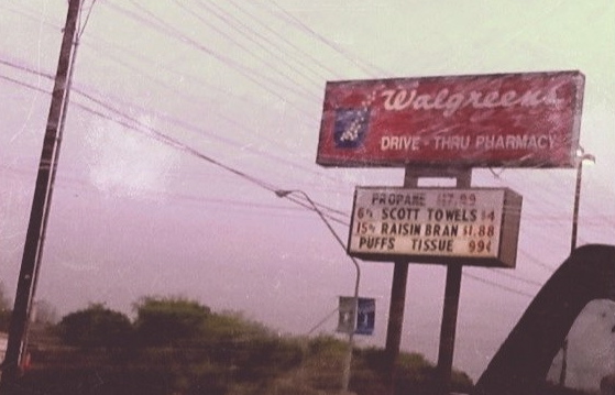
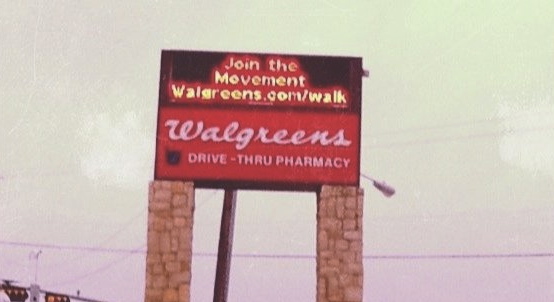
Last week, I posted the briefest post ever here and it was centered around the evolution of signage. I was on my way to work and within 1 mile of each other, I saw a traditional (1.0) sign at one Walgreens and then a digital (2.0) sign at another Walgreens. This got me thinking about the 3.0 version of this one particular sign. What would that be?

Well, then, I started thinking more generally about the OOH space and what 3.0 signage and/or experiences are. I think it’s easy to assume that if you throw some sort of interactive technology at any sign, you’ll have the next generation, 3.0 version of anything. But the more I think about it and the more examples I see, the more I doubt that assumption.

So, I’m going to document another exploration – this one focused on the evolution of OOH. I’m not interested in one version of anything. I’m interested in exploring multiple versions of a similar medium (billboards, posters, kiosks) – like the Walgreens sign. I’d love for you to be involved, too. If you come across any examples, I’d welcome you sharing them here. I think this is a topic ripe for discussion and would love to have more voices represented here than my own.

I don’t think there is much definition in this space, even around those things that have been defined. So, let’s mix it up a little bit more. And maybe in the process, provide some clarity in this ever-evolving space called Out of Home.

First up is a poster. And yes, I’m calling this a poster vs. a billboard. There’s a higher potential for information, length of engagement, and human interaction with this than a billboard.

Here is a simple 1.0 version of a standard poster:

Tropicana standard posterAnd here’s an example of another poster, this one powered by electricity from oranges. That’s right, oranges. This, to me, is an example of a 3.0 version of a poster.

I just think this is creatively brilliant. But that alone certainly does not signify the next generation of OOH. I think there are a few characteristics of 3.0 OOH that can help differentiate it from everything else that we see. While this is not a complete list, it’s a starter:

1. The experience – I really believe the critical difference between current (1.0 & 2.0) executions and next generation (3.0) executions is in the experience. Nothing more. I think you can create an experience around any execution in many different ways, but in the end, there’s something fundamentally different in 3.0 executions and it has to do the experience.

I think it’s simple to get to the bottom of different versions by asking 1 question – “is there an experience?” If there is, you can dig a little bit deeper to try to understand if the experience is new and/or unique and constitutes the next generation.

Here, there’s a clear experience – different from most any poster you’ll ever see – and that is to see behind the scenes, so to speak. The oranges fundamentally change the experience. If there weren’t any oranges, or a unique power supply for that matter, we’re looking at a standard digital poster. And a fairly boring one at that.

2. Sharability – Through any experience comes sharing, from straight-up offline word-of-mouth to online social communities to everything in between. Technology has enabled sharing with masses easier and quicker, but if the experience is not worthy enough (be it the biggest, best, worst or first), no one is going to want to share it, regardless of how easy it might be. Ease of sharing from the experience might separate the execution from others, but the real difference will be in the sharability factor – is this something that people want to share?

Here, there are no (share) buttons to press or codes to interact with or anything like that. But it is an execution that is unique and different and probably the first one that people have seen like it. It has a natural sharability factor. As you can see in the video, people want to capture it in some way and I’d bet that the photo and/or video doesn’t stay in that digital device for their eyes only.

3. Smart – On one hand, you can approach this by asking, “is this execution smart enough to tailor messages to me?” Does it and/or how effective is it at distributing the right content at the right time to the right people? These are some of the things that digital signage enables in an efficient manner – the ability to customize messages/advertisements based on things like time of day, audience demographics, and actual placement. But to me, these are now table stakes and they don’t separate standard digital signage from being a 2.0 execution. 3.0 executions have to do more. They have to be smarter, or at least appear to be smarter.

On the other hand, there’s a completely subjective aspect to how smart something is. And I think it has to do more with creativity than anything else. Both aspects here can separate 3.0 versions from the others.

I would consider this execution a smart execution. To realize the true power in oranges, enough to generate electricity and to power a poster is just smart. No two ways about it.

Oh yeah, there’s a fairly substantial potential energy impact it could have, too. That’s pretty smart, too.

4. Scalability – This is obviously an important factor to change the landscape and/or consumer behavior and/or how we interact with the outside world. If it’s not scalable, it’s probably not going to change much and its novelty will fade away at some point.

I have a feeling that many 3.0 examples we see are not going to be scalable. At least not right now. For the most part, they’re going to be experimental in nature. The result of these one-off experiments, however, could be one step on the innovation ladder to a larger, scalable, 3.0 execution.

Again, this is the beginning of this exploration. I’m sure as I (and hopefully, we) encounter more examples, we will continue refining this lense. I’d love to hear and see your thoughts. Think I missed anything that separates 3.0 experiences from all others? Share them here. Find an example? Drop it here. I just think this space is fascinating and full of potential. With some creativity and thought (not necessarily new technology), these 3.0 solutions can make our lives easier – not creepier – easier. And regardless of how cool or novel something might be, the exciting thing is in the potential impact it could have on our lives.


Friday’s 4-1-1, Signs on My Morning Journey Style

I live in the country. No two ways about it. So, when I look around at all the (or lack of) technology in my everyday path out in the real world, on a daily basis, I’m certainly seeing the lite version. When I go closer to the city, or god forbid, in the city itself, it’s drastically different. Last month at SXSW in Austin, everywhere I turned there was a different technology, either displaying something in my face or enticing me to interact with it. And Austin, as a city, is completely different from Dallas as a city, as far as outdoor technology goes. I’m often actually amazed at how naked downtown Dallas is compared to other major cities like Austin or Chicago or NYC. Still, technology is all around us, everywhere we look, even in a naked city like Dallas, and even in the country where I live.

This morning, I stopped by every digital sign and interactive kiosk I noticed on my journey from my house to the train. And even though I live in a rural part of the country, I still encountered technology all along the way. Here’s that journey:

11th Screen | The Interactive Out of Home Blog

The sign outside the City Hall/Library, then the local Walgreens sign, then the Redbox outside its front doors, then the church’s sign, then the bank ATM, then the (boring) car wash clock, followed by the train ticket kiosk, then the train station sign, and finally, the sign inside the train. That’s the journey every morning.

So, I want to use today’s Friday 4-1-1 to reflect on the good, the bad, and the ugly of this technologically-fascinating & rich journey.

1. Snooze-fest – man, oh man, how boring can you get in terms of digital signage/interactive kiosks? These are the quintessential examples. The 1.o of both. And they’re all around because I mean, if they’re all the way out here in the country, they’re surely in the city, too. But you know what? I notice them because they’re….

2. Attention-getting – even if it is for a split second, I notice digital signs like these. Because they’re moving and/or colorful. Not for any other reason. Whereas it takes something more for me to notice a traditional billboard or poster – it usually has to stand out creatively. So, digital has that going for it. But the thing is – after I notice it, there are many times I instantly turn it off. If it’s not something and/or somewhere that interests me, I don’t care. So, in this regard (at least to  me), digital signage is more effective at getting eyeballs (awareness) to see more messages (reach), but not necessarily more effective at affecting consideration. Regardless, there is still an opportunity to drive consumers deeper into the brand through the sign…

3. As a connector – even boring signs like these have the ability to drive consumers deeper – at the very least, to a website. I’m amazed at how many of these signs that don’t do anything other than slam those (scrolling) messages right down our throat and pay no attention to the opportunity to do a little bit more. It’s ironic that whoever is making those decisions – like the one to install digital signage – is choosing not push the consumer farther down the brand experience path. I know it’s hard. But welcome to 2011.

4. Utility machines – yes, digital signage and kiosks like this are good for something. And it’s utility. Not experience. I talk a lot about always looking for ways to create an experience through channels/platforms like these, but it can’t, and shouldn’t, be done all the time. I do wonder what the 3.0 version of these will be, though.

“Duh” – technology makes delivering messages more efficient. That’s probably the most obvious thing I’ve ever said on this blog?!?! But here’s the thing – how fancy do you need to get when the only objective is to deliver more messages, more efficiently? Seems to me that there would be a couple of solutions out there in the market that could handle all of the different ways and scale to achieve this objective. As it is now, it seems like there are 100’s of solutions. Why?

“Uh-huh” – sometime in the (near) future, these signs will all be connected – to each other and to us. The Internet of Things, while futuristic and fantastical, is real and coming. If we don’t see a 3.0 version of these signs before then, well, I guess we will then. I wonder if network operators and the whoosits and whatsits in the industry understand?

Yes, my daily journey is low-fi, in terms of DOOH/IOOH. But I notice it all and on a level, appreciate it. For the most part, it serves its purpose.

What do you see on your regular daily activities? Is it anything like this?


Skittles Shows Us a Unique Way to Interact with Content

11th Screen | The Interactive Out-of-Home Blog

When I say touch screen, what do you think of?

Maybe your phone? Maybe the ATM? Maybe the self-check out at the grocery store? Heck, maybe even something like the Kohl’s kiosk?

When I think of touch screen, I think of all of these things. But boiling it down, I think of physically touching a screen to elicit an action. Whether it be for utility or experience, my finger becomes the mouse and guides my path through and experience. The experience is the thing. With expectations of fluidity in movement and functionality becoming higher and higher, it’s less about the touch and more about what it enables. The touch, though, is something that makes the experience instantly personal.

I have this thing about non-interactive digital signage and suffice it to say, I think any screen outside of the home not only has the ability to be made interactive, but it should be. Particularly digital screens. And that doesn’t just mean touch. How easy is it to include an SMS shortcode?

Well, Skittles might have just made the game a little bit easier. They’ve introduced a concept that I think all digital signage content producers should take note of: how to make content interactive via touch without a touch screen. See for yourself. And follow instructions – hold your finger there.

How simple, right?

So far, they’ve released 5 different videos and they’ve been pretty popular in a short amount of time (150K – 1.7M views). They’re short, (questionably) entertaining, and engaging. And that’s the key – they’re engaging.

Throw out all of the challenges like hardware and software – as far as digital signage goes – and you can really start to think about the reality of creating interactivity through a simple concept involving the type of content always running – video.

This is not the end-all solution for all those digital screens, but certainly for many of them within physical reach. There are many other factors to consider when deciding on the actual type of OOH/DOOH solution, I know. The thing is, for an industry that is so technology and advertising-centric – two debilitating constraints in pushing the limits – this is an example of how a basic piece of content, even in the form of an ad, can be manipulated to create engagement. How it can turn an otherwise static screen and message into something that deepens the brand experience and strengthens the relationship. And how creativity in storytelling can break down barriers that technology creates.

After all, it’s the content, not the technology that really drives true interactivity.


Macy’s Shows Us How to Think About (& Use) QR Codes

Macy's Backstage Pass QR Code

I have a love/hate relationship with QR codes.

On one hand, I love them because I think they’re a great enabling technology – a technology that bridges the offline world with the online, which is essential in driving any level of engagement when connecting with consumers outside of their homes. They’re efficient, convenient, and potentially rewarding. That is, they’re easy to use and they can unlock rich content.

In theory.

This is the hate side of the equation. Bad QR code executions are commonplace out there in the real world. Brands don’t know where to put them – should they go on TV or other digital screens or just be confined to print materials? Brands don’t know what content to put behind them – should they just unlock a website or an entry form or some sort of rich, multimedia content? But most of all, brands don’t seem to understand consumers’ awareness and comfort level with them – should they include instructions or an alternate way to access the information or just leave it to consumers to figure out how to use them? These are all general statements, I know. Yes, I have seen my fair share of quality code-based initiatives over the past 1.5 years, but they pale in comparison to the poor executions.

I believe now we’re seeing something that normally happens with any sort of technology that doesn’t wash out to the ocean of nothingness – on the consumer side, there is an awareness with what the technology is, and on the brand side, there is a drive to understand how best to use the technology to impact behavior. This adoption/impact wave is a long one. Right now, we’re just seeing brands actually understand how to best use social media to build relationships and impact consumer behavior. And social media (er, web 2.0) was introduced 5-6 years ago. That’s not to say QR codes will take 5-6 years to figure out, but adoption of technologies and new ways to utilize them do not happen overnight. They also require a fair amount of deliberate thought. They’ll hardly work if they’re just thrown out into the world for everyone to figure out.

This is what I’ve seen more often than not with QR codes.

So, it was refreshing to actually see a brand utilize traditional media channels in their marketing mix to raise awareness of their QR code campaign. A couple of weeks ago, I saw this Macy’s commercial on TV.

I did a double take. I had to rewind it to make sure I was seeing this right. A brand devoting a national TV spot to their QR code campaign? Brilliant.

I think the true brilliance is in the spot itself. It doesn’t just highlight the technology, it explains it. It explains what it is, where to look for it, how to use it, and most of all, what consumers can expect to get out of it. It also doesn’t limit this content to QR-code-only access. Have mobile phone? Can text? Then, not to worry, you can still experience this same content.

Now, when consumers go anywhere near Macy’s and see one of these pixilated stars, they at least have a better chance knowing what it is and what they can get out of it – two critical pieces needed to drive adoption and result in success.

And they’re not just focused on TV. They’re using many channels in their ecosystem to introduce, educate, and drive engagement with this star. Like on their Facebook page:

Macy's QR Code

On their windows:

Macy's QR Code

And of course, in their store:

Macy's QR Code

This, along print ads and even their staff wearing lanyards that explain what the program & code are, show how deliberate they want to be with this campaign.

Who knows if it will work? And more, who knows if QR codes, as a technology, will endure time and actually become adopted by the general consumer. In 5-6 years, we’ll know, right?

But this much is certain, and has endured over time – whoever reaches consumers at the right time with the right content will win.

The problem is – we’re living and consuming media in an evolving world, where consumers are on the go, out & about more than ever, technology is not the barrier it once was and everyone is connected. The rules have changed. Now, the right time to reach consumers is different for everyone. And it’s typically when they’re not in the confines of their homes.

Traditional broadcast channels like television are still great awareness channels, regardless of what you say about DVR. Non-traditional, emerging channels like Out-of-Home (OOH) and mobile are more and more becoming great engagement channels. Everything needs to work together. And Macy’s – much to their credit – has recognized this and is actually doing something about it.

I know the jury is still out on QR codes so I’d be interested to know if you think even a full-out marketing blitz like this will move the needle, in terms of QR code adoption and engagement? What do you think?

Out & About: DFW Airport Touch Screen Terminal Assistant

So there I was walking through Terminal D of the DFW Airport close to midnight and all I wanted to do is get to my car so I could go home. Then, out of the corner of my eye, I see this – another 11th Screen (IOOH) example – a large display that looked like it was just inviting a touch. So, of course, I stopped, got my trusty flip cam out, and started to poke around on it.

Let’s dust the scorecard off and put ‘er to the test.

Purpose – This is simply an interactive information kiosk that just happens to be an 80″+ touch screen. It’s designed solely to give travelers all of the essential information they need while they’re in the terminal – places to eat, where to shop, where to get your shoes shined, where the restrooms are, flight information – anything any traveler needs to know. Right at their fingertips. On an 80″+ touch screen. Mission accomplished.

Drama – When does an 80″+ touch screen not create a sense of drama? For the experience, I think it’s a bit like using a bazooka when you need a pea shooter. But the size is the thing that tipped me off to its interactivity. Ironically, I think it’s too well designed because the screen and structure fit right in to everything else in the terminal, so one could easily pass right by it thinking it’s just a big sign. And that’s the biggest problem. There was no clear call-to-action on the screen, nothing really that says, “hey there, why don’t you stop and touch this screen because I’ll give you some great information.” Instead, it’s just a silent 80″+ screen.

Usability – This is a simple experience so it’s usable. Or maybe it’s the other way around? In any case, this was an easy experience to navigate through. It wasn’t deep with content, so after you drill down a couple of times, you’ve hit the end of the path. But the GUI is laid out in a way that allows you to get to other pieces of content in a single press. As far as the functionality goes, I would underwhelmed with this experience. I wanted more and as you can see in the video, I expected it to function different than it actually did. With a large touch screen like this, I expect the functionality to be just as big. Not complex or obnoxious, but in some way commiserate with the size of the screen.

Interactivity – This is a single touch, single user touch screen experience. For a screen this big, they could have planned for multi-user interaction and created a rich experience. As it stands – in its current state – it’s as basic as you can get. The response and its functionality, after you press one of the buttons, is not distinct enough to let you know that something has happened. So, while the screen is responsive to your touch, the action (or seeming lack thereof) makes you think that it doesn’t work.

Information – To me, this succeeds at 1.0 information, but fails miserably at 2.0 information. Yes, it contains all of the information that it promises. But it’s base-level information – the name, the place, and the location. This experience could be made instantly better by integrating LBS (Foursquare, Gowalla) and/or consumer reviews/comments (Yelp?). Our friends at LocaModa would have a field day with this experience.

Personalization – There was no personalization in this experience. I think a social component – check-ins, reviews, comments – could add a welcome level of personalization to this. It would be relatively low user commitment, especially compared to the high level of benefit this sort of information would provide.

Overall, the lack of social integration has been a huge theme in these touch screen experiences over the last year. I am starting to feel like single-source information is not good enough anymore. But these are the things I pay attention to. I’m not sure that the average consumer – or traveler in this case – cares so much about it. Here’s the thing though – when their first impression includes social content, they feel like this is just another extension of what they’re used to when they use their computers or their phones. When it doesn’t include social content, I think we run the risk of not providing the type of value they need (based on their not-yet-completely-understood expectation).

More than that, though – when you’re going to do anything with an 80″+ touch screen, the experience better be 80″+.