Simplicity, I’m finding, is really where it’s at. Perhaps I’m more sensitive to it since I’m right in the middle of Excess City. The solutions that are sticking out to me are the ones that require me to do very little while interacting, and give me the ability to share with others. I walked the floor a number of times today and I was just so overwelmed by the barrage of touch technology, I didn’t interact with anything. Outside of this environment, I’m sure I’d interact with all of the solutions. I’ve got to keep that perspective tomorrow so I can interact with, what are probably many, effective solutions.
Those which I did interact with fell into 2 buckets: (All are examples Interactive Out of Home (IOOH)
1. Simple, usable, and effective
2. Complicated, unusable, and frustrating
Example 1, falls in the 1st bucket:
Standard OOH made interactive through mobile enabling technology. The only problem with this one is that it’s on the back of this brochure and the graphical callout that houses the Call-to-Action (CTA) doesn’t stand out (black on black). So, it’s easy to miss.
Example 2, falls in the 1st bucket as well:
Digital OOH made interactive through mobile enabling technology. Text photos, a message or even Tweets and they’ll end up on these screens for everyone to see. I really like the engagement here. All different. All unique. And most importantly, especially for me today, all easy.
Example 3, falls in the 2nd bucket:
DOOH made interactive through enabling touch technology. I think wayfinding is one of the most logical, practical uses of touch technology, but ironically enough, I think it’s one of the most overly mis-executed solutions of touch technology. This one lives up to my very low expectations. I couldn’t figure it out, much less find my way anywhere.
I think it’s important to look at these examples through a cost/value lense, too. The two effective examples, I believe provide great value for the cost. The ineffective example, however, provides little to no value for the cost. In fact, the cost heavily outweighs the value in my opinion.
You feel me? What are the most effective IOOH solutions you’ve seen and interacted with?
And then, reality set in. More like, the Blackberry started exploding. We are planning a HUGE program for one of our clients at South by Southwest, which is in 2 weeks, so needless to say, there is LOTS to be done.
So, I missed out on part of the next phase of the tour, which was in the new City Center. This place makes the Hard Rock look like small time. The scale is simply amazing. It’s an $8.5 billion “megaplex” full of shops, casinos, hotels, condos, restaurants, a standalone convention center, and even comes with its very own Fire Station. Ridonkulous.
Even more, and this is what I’m talking about “scale,” – these guys operate over 300 digital screens in this complex, but in their network, beyond the City Center, there are over 1,000 screens that they operate – all via 1 control system. All different sizes. Some digital. Some interactive. Some for slots. It’s crazy.
I smiled with satisfaction, extending kudos to my previous co-workers, when the guys at Aria Resort & Casino (our primary stopping point) talked about the hardware they use for each one of the screens. Mac minis. Which is what we used for our interactive solutions. They’re great devices – powerful, flexible, with a small footprint.
I was really impressed with their team. They only have ~11 on staff that run this entire operation. They custom build applications. They implement and run one of the most recognizable digital signage networks in the world on the Las Vegas strip. They think about measurement (they track what people are interacting with and for how long) and they’re even thinking about future iterations.
I missed the part of the tour where they take everyone around to all of these different screens and let them play with them. You know, the fun part. Something that I could have done all afternoon. But actually, I don’t know if I could have, because honestly, it was all so overwhelming, coming off of the experience at Hard Rock, into Digital/Interactive Signage World. I had a hard time digesting everything.
I played with one of their interactive directories, which I found to be a bit confusing:
And they had these digital placards outside of their conference rooms, but they were not interactive:
Digital menu boards. Digital advertisement screens. Digital marquees. Digital slot machines. Interactive wayfinders. Interactive directories. If you want it, they’ve got it – at least digitally. And that begs the question to me, is it needed? Are digital menu boards needed? My friends, Phillip and Seth, both had strong opinions that they are not. I think I agree with them. But then I think, is it OK to do digital just to do digital? Once the infrastructure is set up, there are many benefits, regardless of placement, purpose, or interactivity. So, I can see value in it. Especially when everything else is digital. If their only digital solution was a digital menu board, I would think differently. But when you have your whole City wired, of course, you’re going to have digital menu boards.
This, I believe, is a great look into our future. A real future where technology is incorporated in everything all around us. I didn’t own one thing that I interacted with today. But the interesting thing was, while I didn’t need to own the device from which the experience originated, I wanted (and needed) to use my own device (mobile, Flip) to share the experience.
And I think that is a very important piece to this puzzle.
Up, up and away. Here we go, Mike’s Digital Signage Expo 2010 Adventure has begun. I’m going to chronicle A LOT of my adventure here, so be prepared. It’s not just going to be news, or the latest greatest technology and trends. It is going to be the entire experience from my point of view, every step along the way. It all started bright and early this morning:
4:11 AM – my body clock woke me up. I looked at the alarm clock. I had 19 more minutes to sleep before the alarm started barking.
4:30 AM – the alarm clock started barking. I turned it off, got up, dazily walked into the kitchen, pressed START on the coffee maker, and hit the shower.
5:50 AM – checked in at the self-serve kiosk, which by the way is probably the most widely accepted interactive kiosk (what I call “Interactive Out of Home”, or “IOOH”) in the U.S. today, outside of the ATM.
6:13 AM – pulled money from what I suspect is the most widely accepted interactive kiosk (IOOH) in the U.S. today – the ATM.
6:32 AM – checked in “On Da Plane” via foursquare (become my friend – “mikecearley”)
6:45 AM – flight departed.
6:46 AM – found two interesting mobile advertisements that could easily have been made into IOOH examples in the American Way magazine. Before I get into those advertisements, I think it’s important to make clear, again, my viewpoint on OOH + technology. “Digital Out of Home” or “DOOH” is the term that is used to describe anything that falls into the OOH category and has technology associated with it. To me, that is such a wide generalization and practically accurate, but not always technically accurate. “Digital” Out of Home is any standard OOH solution that is made digital by display technology. There is a finite list of display technologies – LCD, LED, plasma, projection. If there are any other display technologies, please let me know, but it’s a small list. This, to me, defines Digital Out of Home. There is no interactivity associated with Digital Out of Home. But since technology is the foundation of “Digital” Out of Home, interactivity is inherent. Not always used (in fact, used much less than I think can be. I hope to see advancements made on this front in the industry this week), but inherent. Standard OOH initiatives can also be made interactive. Case in point:
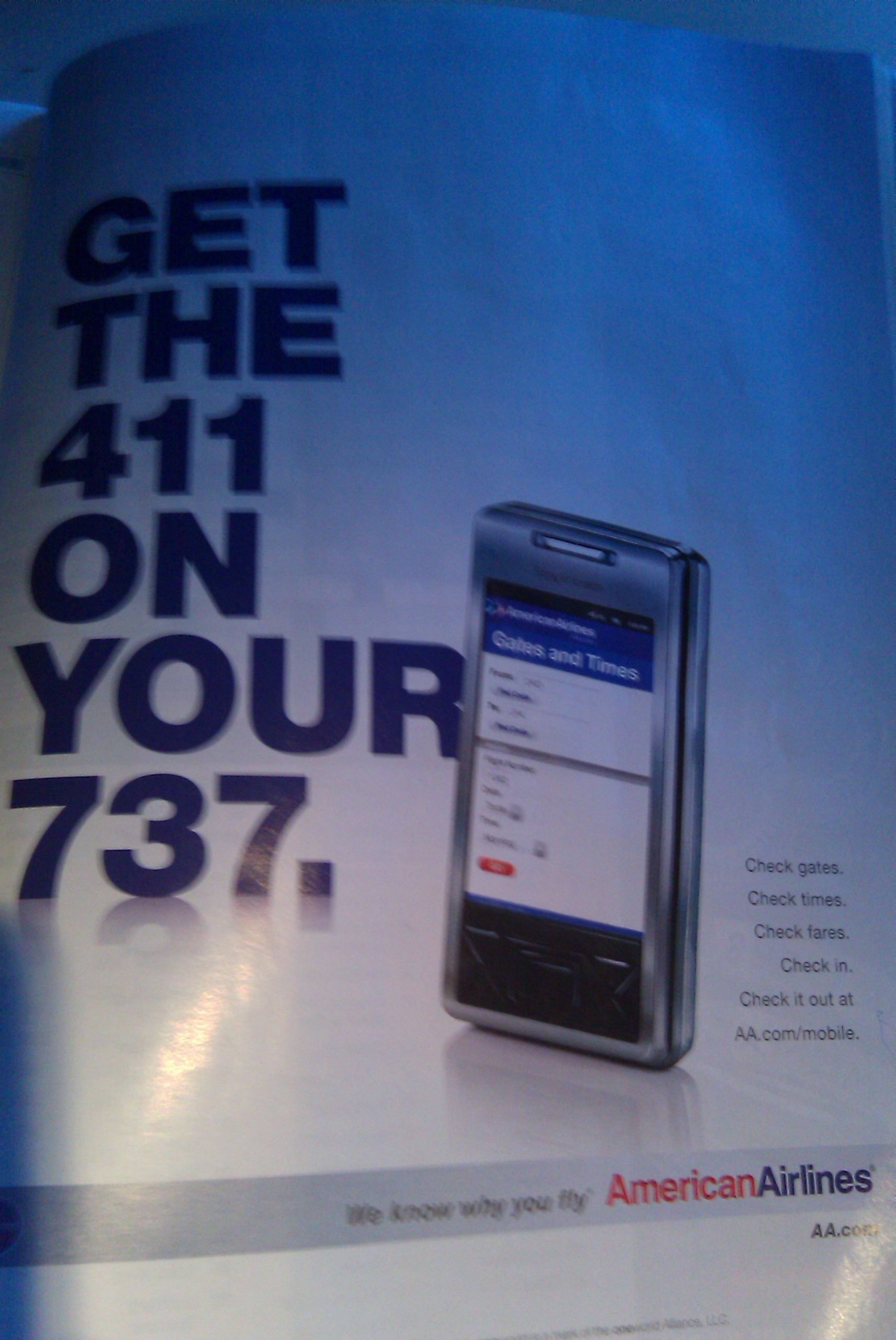
Example 1:
Simple mobile app that the user can access at AA.com/mobile (which doesn’t work btw). Put a short-code on this ad (which I originally thought it was) or a QR code/MS tag, and send them directly to the app from the magazine ad.
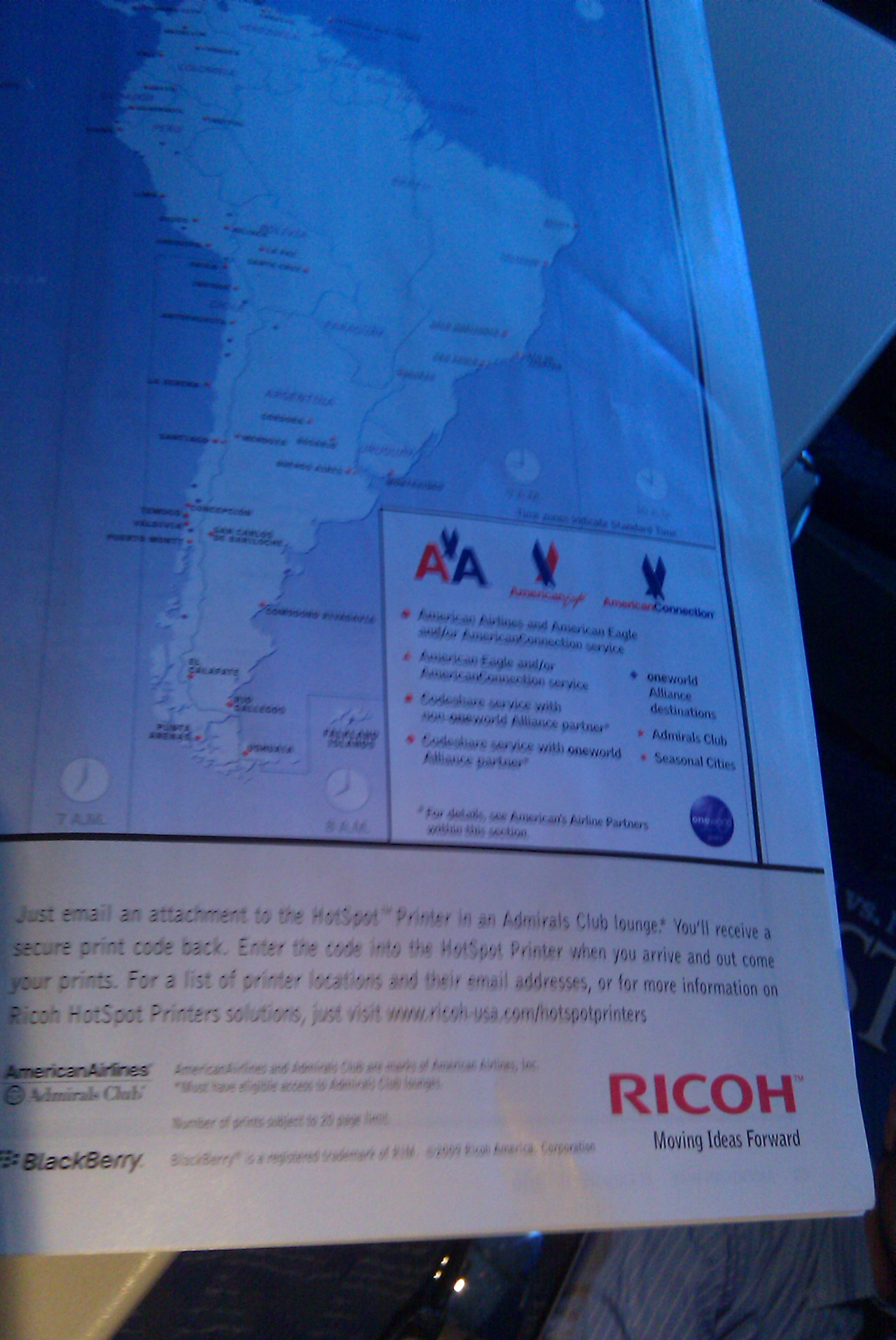
Example 2:
Print any attachment from your smartphone on one of these fancy HotSpot Printers. There’s a simple process to go through, but when you do, voila, you’ve got printing on the go. So, here, if I wanted to take a picture of this map, from this magazine, I could take a photo of it, email it, and print it, all from my phone.
This magazine is a device, medium or platform that I do not own, so by my definition, it is an “Out of Home” solution (in this case, an object). The brand is driving me deeper into an engagement through the use of enabling technology, in this case, my mobile phone. Thus, we have an Interactive Out of Home solution, or IOOH, which is a term that I’m officially coining (at least the acronym). It’s my truthiness.
8:46 AM – passed over the Grand Canyon. Even from up here, it looks grand. I’ve had the fortune of visiting the Grand Canyon. It is something that I think everyone should do once in their life. It is amazing. I will bring my family here when the kids are old enough to appreciate it.
9:18 AM – landed in Las Vegas. Off to the convention center to get my press passes. Then, to the hotel to drop my bags. Then, to the Hard Rock Café to depart on an awesome behind-the-scenes tour of Las Vegas’ $11 Billion City Center and Hard Rock Café.
“The most exciting part of the tour is the behind-the-scenes look at advancements in digital signage control – everything controlled from single laptop computer equipped with state-of-the-art software to the remote control of over the 1,000+-screen installation at City Center and the other MGM properties up and down the Las Vegas strip.
Stops will feature Interactive reader boards, progressive Slots & Video animations that tie-in to progressive jackpot meters and table top displays; restaurant interactive Touch Screen Menus, interactive wayfinding through a 500,000-square-foot shopping center, video walls, and a huge multi-user, multi-touch interactive digital wall.”
I’d like a number 10, 20, 28, 34 and a Super-Session to go, please. To those of you going to the DSE next week, these numbers probably mean something to you. To those who aren’t going, these are the sessions that I plan on attending. Here’s the rundown:
Session #10 – How They Did It: Three Real-World Models for Successful Communication-Based Digital Signage Networks – Representatives from Reuters, a college (John Marshall Law School), and a medical facility (Mayo Clinic), discuss their DOOH networks and installations. All of these seem like they’re fully integrated into their respective businesses and have clearly provided value back to their audiences. I hope they’re able to cover their different expansive installations, the thought and buy-in that had to go into each of them and then ultimately, how they each look at success. It will also be interesting to know what they think the future of DOOH looks like.
Session #20 – Creative Tactics for Integrating Digital Signage in Different Environments – This looks to be all about innovation, particularly in various approaches to a wide range of OOH environments and how to best incorporate digital/interactive signage into them. A Dallas-comrade, Steve Gurley, from Symon Communications here in Plano, is on the panel. We’re going to get together for coffee afterwards. I’m looking forward to meeting him and learning more about his company. They provide all sorts of DOOH solutions, including multiple interactive solutions.
Session #28 – Integrating Multi-Channel Strategies: A Roadmap for Digital Cross-Platform Success – This is the session that interests me the most. Primarily because it is one of the sessions that I think is closest to my specific interests – making the 5th Screen (digital signage) into the 11th Screen (through the use of all sorts of enabling technologies). I think they’ll probably discuss the incorporation of mobile into digital signage more than anything else. But I’m also interested in it because Stephen Randall of LocaModa – the man behind the company that brought us Jumbli and LBS-integration-into-digital signage – is on the panel. The other dudes on the panel are no slouches, either.
Session #34 – Trends in Interactive Gestural and Touch Screen Applications – Now, we’re talking. “You will learn how organizations such as the Official NYC Information Center and MIT SENSEable City Lab are using advanced touch-sensing and gesture control technologies to bring a whole new dimension to interactive user experiences.” It’s going to be sweet. Enough said.
Super Session – Digital Out-of-Home’s Future – I can’t go to the premier Digital Out-of-Home conference without attending the session where industry leaders discuss its future. It’s the one that has the biggest potential of let down, though. These types of sessions can be so general, especially in an hour. But I’ll be there.
Then, throw in a couple of coffee meetings, a few on-floor workshops (including one by Keith Kelsen, visionary in digital signage), and a “mixer” here and there, and my calendar is pretty much full.
Oh, and there’s work, too. That doesn’t stop.
It will all be busy, but really good.
Is there anything you’re particulary interested in learning about digital signage or the industry? Let me know and I’ll do my best to get it answered.
A week from right now, I’ll be in Las Vegas for the Digital Signage Expo! I’m really excited to go and see all of the advancements that have been made in the industry in the past year. I was there last year and saw some great products and met some great people. I expect this year’s event to be a positive evolution on all fronts.
I have been reading the DSE’s Q4 Quarterly Business Barometer, and it only enhances my excitement about next week, and in broader terms, the future of the industry. If I were to give you my condensed recap, it would go something like this:
Digital Signage/DOOH is here to stay. Despite the economic climate of the last year. Despite the oversaturation of providers and networks (which have been consolidated, but more is needed). Despite the lack of clarity in measurement. Despite the lack of integration with media companies and agencies. And despite the fact that most marketers misunderstand the capabilities of “digital signage.” 38 pages in 59 words + 1 acronym. Not bad, eh?
My projection for 2010 is even shorter & simpler:
We will continue to see digital signage in our environments around us. This form of communicating (and connecting) will not go away. Only the strong will survive, though. And “digital” just means display technology. “Interactive” will be the new “DOOH”. (39 words + 1 acronym)
With three little ones, we often frequent venues that allow us to consolidate our tasks into one physical space. Super Targets and malls, especially malls with play-areas-for-kids, are high on our list. Malls are a fascinating place to me, although I don’t like spending lots of time in them. What fascinates me, aside from the people and the over-saturation of “things” is the lack of technology that exists inside them. I still see the static, Dewey Decimal System-like mall directories (that’s what I always think about anyway) that were around when I was a kid. I can’t believe those things still exist?!? Those scream touch screens with wayfinding + behavioral targeting + mobile couponing + social engagement – they’re really an endless well of multi-channel technological usefulness.
But by an large, these don’t exist. Digital signage is slowly becoming a standard in malls, but interactivity with that signage doesn’t even seem to be on the radar. So, I was giddy when I saw a digital signage solution that encouraged me to interact with it. (NOTE – I did not capture the best content to represent my experience. Next time, I’ll know exactly what to get for the set-up and pay-off to tell the best story.)
In any case, these digital signs were scattered throughout the mall, not as a digital directory, but as a vehicle to deliver moving, engaging content, be it movie trailers or dynamic store advertisements. On one of the “pages” of the scroll, there was a contest that encouraged users to take a photo in front of the sign and post it on their Facebook page.
So, I took my mobile phone, positioned myself in front of the screen, and smiled:
Then, when we got home, I uploaded the photo on their Facebook page:
And I was happy. As it ends up, I didn’t win, but I had lots of fun doing it, and appreciated a brand driving me deeper in the experience through digital signage and enabling technology. This is a good example of DOOH being made interactive through this sort of technology.
With a few tweaks, I think this could have been a better, more effective initiative, but they deserve kudos for utilizing the digital signs in this way. I hope to see more of this sooner rather than later because I think it’s one of the easiest, most natural extensions of incorporating multi-channel technological usefulness into the spaces around us.
Now, I am not a world-wide mall-goer. These are my observations based on the malls I have gone to primarily in Texas. If you have seen any other examples like this, particularly in malls, please send them my way.
I’m a little bit late to the game because this particular solution has been out for quite some time. It’s worth more attention, though, albeit not-so-timely. These boys know how to do it. True 11th screen material. They built the world’s biggest multi-touch, multi-user wall at a race track complex in Germany.
I’ve developed a guide that helps me look at solutions like this – 11th Screen solutions, if you will – in a consistent manner. It’s not a measurement tool, by any means. It’s not designed as a magic formula to produce quantitative results. It’s simply designed to help me look for the same components across all kinds of IOOH (11th Screen) solutions. It’s my attempt at leveling the playing field in an area where the field is far from level. For each “criteria,” I simply give a PASS or FAIL.
So here, we’ll use the Ring Wall to inaugurate the official 11th Screen perspective. Understand that I have not interacted with the wall in person. I’ve only watched demonstrations. My comments about the wall are made entirely from observation.
Purpose – What is the purpose of the solution? Is it to drive awareness? Acquisition? Loyalty? What is the brand trying to accomplish in this medium?
In my mind, this is the most important question to ask. It should define the exact solution. Brands can do one thing through a billboard and something entirely different through a kiosk. More often than not, I believe that brands utilize the OOH medium as an awareness-only medium. I think there is always an opportunity to drive consumers deeper into the brand, even from the biggest “awareness-driven” installation – a standard billboard.
Here, the Ring Wall looks like one big awareness machine. It enables many users to experience information, but it’s the same information for every user. There is no “deep dive” for data capture, personalization, or even an extended experience.
11th Screen Score: If the objective was awareness, I don’t know how they could have done any better. Taking that assumption into account, they PASS.
Drama – Does the solution make a big impact on the user? Does it make them stop and interact?
Since everything we’re talking about is interacted with in the physical spaces around us, it must have some drama to it to entice people to interact. This can be accomplished a number of ways – the physical installation, its movement, its content and its call-to-action.
The Ring Wall has an immense amount of drama. First of all, it’s huge, the largest of its kind. Second, gesture-based technology allows content to move with the user as they walk by, engaging them without even a touch. I think where it falls short, if any place, is providing the user a clear call-to-action. It might seem simple to have a big “Touch Me” call-to-action rolling throughout, but I think intimidation is still a big barrier with acceptance and use of most touch screen installations. The clearer you can be with the action you want the user to take, the more success you should have at breaking down that barrier.
11th Screen Score: I don’t know how much more dramatic one can get. PASS.
Usability – Can the user navigate through the experience with ease? Are the paths to information intuitive? There’s also an element of functions, too, but I think that is much more subjective. Do the functions enhance the user experience?
The biggest killer to any touch screen installation, once the user starts interacting with it, is not knowing what to do and/or how to get to the desired information. It’s critically important that foundational elements like content grouping(s) and navigation hierarchy are intuitive. Herein lies the challenge though. Old website standards are most often not applicable because interaction in this medium is so open, non-linear, and tactile. Navigating a website with a mouse on a computer is different from navigating a website with your finger on a touch screen. It’s vital to understand the audience when concepting and creating an experience like this. You and I might be able to walk up to this wall and use it effectively, but would our mom or dad?
Here, the Ring Wall’s user interface seems to be intuitive. The navigation looks to be consistent with a standard website homepage (primary navigation at the top, eye level with 3 callouts below the main content area) and as a result, clear. Also, the user has multiple ways to navigate in the experience. They can use the scroll wheel above the gallery to navigate as well as the FORWARD/BACK arrows on the main images. It doesn’t hurt that every ‘panel’ displays the same UI, too. And the functions look fluid and cool :)
11th Screen Score: It’s hard to give a definitive score in this category without touching it and using it myself. From the interactions I can observe, it looks to have a good user experience, thus PASS.
Interactivity – How does the user interact with it? Is it gesture-based? Is it touch-based? Can the user interact with it through any other enabling technology?
This consideration is really an extension of Usability. But whereas the Usability consideration focuses more on how the content experience is laid out, the Interactivity consideration focuses on how much effort is required to interact with the physical experience. If it’s gesture-based, how responsive is it based on the user’s interaction? If it’s touch-based, how responsive is it based on the user’s touch? If it requires an enabling technology, how easy, instant and accurate is it based on the user’s actions? This is the second biggest killer to any touch screen installation. If it doesn’t respond to the user’s touch, the user will either give up or get upset. Either way, they’re not going to interact with it anymore. (And they might tell their friends not to interact with it. And their friends might tell their friends and….anyway, this is food for another post.)
The Ring Wall is both gesture-based and touch-based. When the user walks by, the wall seems responsive. When the user touches the screen, it also seems responsive.
11th Screen Score: Again, it’s hard to give a definitive score in this category without touching it and using it myself. From everything I can see, PASS.
Information – How much and what kind of content is available for the user to interact with?
A system like this is set up to be an endless well of content. I think this is good as long as the user isn’t overwhelmed with that content, meaning they don’t have to see everything “behind the curtain.” Let them know what they’re going to expect and how to get there and leave the rest to them. Drive them deeper into the experience instead of away from the experience. A critical element of this is the type of content in the experience. The Ring Wall includes a good combination of copy and rich multimedia content (images & video). And the video looks like it plays fluidly.
11th Screen Score: There looks to be a deep well of information for the user to interact with in one experience. PASS.
Personalization – What level of personalization does the experience provide?
In my observations over the past few years, this is the one area that I am the most underwhelmed with. The opportunity that we have in this medium, and really the opportunity that I feel has been the least capitalized on, is the level of personalization to the experience. On the surface, any multi-user touch screen includes a level of personalization that allows each user to have their own, unique experience. But on a deeper level, the content is the same for every user. The opportunity that I see is for all of that content to be customized for each user. Simply put – everyone sees what they want to see, even if they don’t know what it is they want to see. And they don’t see the stuff that doesn’t matter to them. This level of personalization requires some level of data gathering from the user, which is always touchy, but can enhance an experience greatly.
Perhaps another way to look at this is ‘does it account for various stages in the relationship process?’ Does it accommodate someone that is interacting for the 1st time? Or the 3rd time? Or the 30th time?
Here, the Ring Wall doesn’t seem to have any personalization built into the experience. It treats everyone the same, whether they are interacting with it for the 1st time or the 30th time. There is an opportunity to personalize each experience, though – be it through a couple of “preference” questions or a higher level of technology like RFID, each user could have an experience most suitable for them.
11th Screen Score: FAIL.
Overall, I just think this is awesome. Major kudos have to be handed out, not only to the development team, but to the clients themselves. They get it. To take the leap on technology like this (both hardware and software) is remarkable, not to mention that the decision was made a year and a half ago, well before the idea of DOOH and/or IOOH was halfway mature, certainly on this scale. It’s combinations like this, with both forward-thinking marketers and clients, that are going to create a new level of interacting with each other and our physical spaces around us that is the norm instead of a novelty.
What do you think of this thing? By “thing,” I really mean the wall, but I’d love to know your thoughts on the scorecard, too. Do you feel like anything needs to be shaped differently on it? Added to it? Just like the space we’re in, I expect it to evolve as we look at other solutions. Comments gladly accepted.
In my opinion, the term “Digital” Out of Home, or “DOOH” is becoming widely overused. So much so that I think it dilutes the space, minimizes the impact of what can truly be done through technology outside of the home, and ultimately, confuses people – advertisers, marketers and brands alike.
I look at the term through a simple lense. Digital Out of Home (DOOH), to me, is nothing more than adding displaytechnology to an otherwise static OOH installation. So, let’s take a billboard for instance. The standard OOH installation is a static billboard. The digital OOH installation is created by simply adding some sort of display technology onto the the static billboard. This can be through LEDs (as is the case with billboards), LCDs, plasmas, or projection. It’s a finite list, but apply any of them to any static OOH installation and voila, you now have a digital version of said installation – Digital Out of Home.
I think it’s important to make this distinction, especially with the introduction of other technologies that make our surroundings, including these billboards, come to life. As mentioned in a previous post, I call these sorts of technologies enablingtechnology. Right now, I think it, too, is a finite list, but it’s a bigger list than display technology. RFID, for example, is an enabling technology. GPS is an enabling technology. Mobile, albeit more broad, is also an enabling technology. But within mobile, I think you start to see a subset of enabling technologies like Augmented Reality, QR Codes, MS Tags, and Bluetooth. Then, you have touch screen technology (single and multi-touch, even gesture-based) that is on the list, too. The point is – these technologies enable personal interactions with an otherwise digital installation. At this level, it is not Digital Out of Home to me.
I sense more and more that the industry and many of the players in it call everything Digital Out of Home just because it occurs outside of the home through any sort of technology. But unless we start talking about it in consistent terms, how can we expect it to catch on and even grow? Do you agree? I’d love to hear your thoughts.
The 11th screen is a multi-piece puzzle. But to me, there are two key pieces. The first key piece is what I previously talked about – bucketing technology into “screens” based on HOW we consume and engage with media. The second key piece is just as important and that is WHERE we consume and engage with media.
HOW + WHERE = 11th screen
My WHERE focus is Out of Home (OOH). The easy way to think of this is the literal translation – outside of your home. For those that this does not make sense to, let me give you my definition of “Out of Home”:
Any experience that occurs outside of the home that does not require the audience to own the device, medium or platform from which the experience originates.
When I talk about “OOH”, this is what it means to me. My basis for everything here will be grounded in this, specifically this part: does not require the audience to own the device, medium or platform from which the experience originates.
If we look at the examples in my previous posts, you’ll see what I mean:
Mini served up messages to people driving on the highway (out of their home) on digital billboards (platform that they didn’t own).
Microsoft created experiences in retail stores (outside of the home) on interactive tables (device that users don’t own).
Now, to me, there’s another key piece to this puzzle and that is the piece of personalization, which really gets to the core of my focus. The way this personalization happens is through the use of technology, specifically through the use of what I’m going to call enabling technology. Like RFID. Like touch screens. Like mobile phones. This is where the lines start to blur, which we’ll experience more and more, but the point is – this sort of technology enables an otherwise static experience to be “personalized” on some level.
So, to personalize their billboards, Mini used RFID chips that were “assigned” to individuals and when that individual drove by an otherwise “digital” billboard, they received a personalized message. Technically, the audience owned the RFID chip. They had to have that in order to receive the personalized experience. But they didn’t own the digital billboard from which the experience originated.
Let’s look at the Spore/QR code example, though- here’s where the mobile phone piece of this puzzle comes into play. There are more and more OOH initiatives that are personalized through the use of mobile phones as the enabling technology. On this example, the audience didn’t own the poster from which the experience originated. But because there was a QR code on the poster, they were able to interact with it through the use of a device that they owned, and as a result, received a personalized experience.
On the other hand, users interacting with the MS Surface don’t own the device, nor do they need to own anything else to experience that level of personalization. Personalization, to a certain extent, is inherent in multi-user touch screen devices.
I think this one of our first big challenges – to understand the difference between “Traditional” and Digital OOH that is made interactive and true Interactive OOH. Specifically, the impact that this difference has on us and the brands that we represent as engagement agents. We know people are spending more and more time outside of their home. They’re engaging with media (and their surroundings) in a way that they have never engaged before. So, it’s important to engage with them in meaningful ways while they’re outside of their homes. But is there a more effective way to do this over another? Is it more effective to engage people through Traditional or Digital OOH made interactive or Interactive OOH?
Aside from creating an experience where the audience doesn’t have to own anything to have a personalized experience, I don’t think it does. What’s the one thing that all of us won’t leave home without? Our mobile phones. So, if we’re using mobile as an enabling technology, what’s the difference?
Perhaps the real question is, is the brand driving individuals as “deep” as they can through their OOH initiatives, whether it be through a “native” Traditional, Digital, or Interactive experience? Are they creating personalized experiences? Are they putting all of the pieces of the puzzle together?
What examples have you seen that effectively put all the pieces together and create personalized OOH experiences?


