Tag Archives: Mobile

Friday’s 4-1-1, The Case of the Mysterious QR Codes Style

There are two things I know to be true right at this moment: 1) I have slacked severely at keeping up with this Friday 4-1-1 series and 2) QR codes are everywhere. And they’re mysterious. Because they don’t include any instructions alongside them. They’re just there. So, I thought it was perfectly appropriate to marry the two to resurrect my Friday’s 4-1-1.

1. Starbucks hides a gem behind their mysterious QR code – while waiting for my coffee one morning, I glanced over to my left and saw a QR code sticker haphazardly slapped on a Frappuccino ad.

Starbucks QR Code SRCH

When I scanned it, I was sent to a digital scavenger hunt game called SRCH. After playing around with it for a little bit, it’s an awesome experience. You’re given a series of clues that you need to solve and at the end, you could win a number of different prizes. The clues are served up as videos, scrambled words, riddles, and photos. It’s a gem of an experience that seemingly can only be discovered through this unmarked, mysterious QR code, slapped onto this ad like an afterthought.

2. Bubby’s hides a coupon behind their mysterious QR code – I recently had the pleasure of eating a great farm-to-table restaurant in NYC called Bubby’s. On my way out the door after dinner, I looked down and saw a flyer with a QR code up in the left-hand corner. Completely unmarked.

Bubby's QR Code

When I scanned the code, I was directed to a coupon to get a free appetizer or 2-for-1 cocktails during their midnight brunch. What a find. Too bad, I didn’t know what was waiting for me behind the code, since there was no context on the flyer. But is it too bad? I’m starting to feel like I want to scan these codes, just to see what kind of gems I can find. But then, when I do, I get a dud like this…

3. NYC Realtor hides housing details behind their QR code – specifically, housing details that I find when directed to a Google search page. Boring.

Realtor QR Code

This is what I’d expect to see behind a QR code like this, especially one with no instructions or call-to-action. But here’s the interesting thing – after scanning the two above before this one, I was expecting a nice surprise. And when I didn’t get it, I was let down. Down to the point that I don’t want to scan again? Of course not….

4. The Canal Room hides their website behind an MS Tag – standard fare again. At least the site behind the code is optimized for mobile.

Canal Room MS Tag

On the site, you can see everything that the Canal Room has to offer – acts, events, showtimes, etc..And I suppose, in this context, right beside their other web properties, this tag makes perfect sense. This the first time I’ve seen a tag placed right alongside the social extensions for a brand, but I think it’s interesting in the sense that it could become as recognized as the Facebook, Twitter, and MySpace logos.

“Duh” – if QR Codes are just going to be another version of a URL shortener that sends consumers to the brand website, I have serious questions about whether or not they’ll ever catch on. Especially if they’re not accompanied by any instructions, enticements, and/or calls-to-action. I see them everywhere, but I never see anyone scanning them.

“Uh-huh” – I think QR Codes are an ideal enabling technology to catch consumers when they’re out and about, in exploring (and shopping) mode, to drive them to take some sort of action. I also believe that they are a great way to drive a deeper brand experience, but as Starbucks and Bubby’s has shown us here, they can be effective at driving purchase decisions. They’re efficient. Even if these are mysterious.

Actually, that could be the key to larger adoption. If they’re synonymous with mystery, would the average consumer scan these things?

What do you think? I’d love to hear your thoughts.

Have a great weekend, everyone. Thanks, as always, for reading!

Redbox – The Good, Bad, and Ugly

Redbox Touchscreen Interactive Out-of-Home Kiosk

I’ve explored many examples of what I would consider to be the 11th Screen solutions here – those that are in some way interactive, by nature, and occur outside of the four walls of your home or office.  That’s a bit of an oversimplification, but the result of interactivity outside of your home is bridging the real world with the virtual world. And as you might have seen here, or observed on your own, there are many different ways that the bridge can be built.

I think one of the simplest examples of this bridge is Redbox (the red movie kiosks). I’m sure you’ve all seen many different Redboxes along your daily journey. I probably have 6 of them on my way to the train station to/from work. In many ways, Redbox is the quintessential 11th Screen example. It’s an Interactive Out-of-Home (IOOH) solution that is enabled by touch. You don’t have to own the device to participate in the experience. It’s a solution that has achieved (mass) scale and perhaps most of all, it’s a revenue generator. There might not be a better utilitarian kiosk solution out there.

Recently, I’ve noticed a few additions to the Redbox kiosks near me and I find them fascinating. Because they’re scratching the surface of becoming effective multi-channel devices. They’re only scratching the surface, though, and I wonder if Redbox is at crucial tipping point. With the introduction and accessibility of live streaming through services like Netflix, the act of renting movies is becoming more and more about the convenience than anything else – more than the true cost associated, more than the experience, and more than the physical disk. And while Redbox has served as a convenient and accessible utilitarian device, the game is constantly changing, in terms of technology and consumer expectation. So, these additions that Redbox has introduced and continues to explore are good, but they have some bad and just plain ugly characteristics that they need to address – and in short order – to have a chance in this rapidly evolving technological world of ours.

First, let me start with the GOOD – as I mentioned, I’ve noticed their effort to become more accessible cross-channel. It makes perfect sense because the one thing that everyone carries with them when they’re outside of their homes is their mobile phone. So, they’re likely to have it right there with them when they interact with the Redbox kiosks. Over the weekend, I saw a special promotion on the front of the Redbox kiosks that drove people to use a SMS shortcode for special offers.

Redbox Interactive Out-of-Home Kiosk Shortcode

This is not a new tactic, but an effective one, especially for a physical kiosk like Redbox. The shortcode promotion instantly provides another channel to drive people back to the kiosk.

In addition to the shortcode, Redbox is using QR codes to make it easy on people to download the Redbox mobile app for iPhone and Android.

Redbox Interactive Out-of-Home Kiosk QR Code

There could be a better way to drive people to the apps, but say what you will about QR codes, they provide instant, easy access directly to the app. And I think they’re more actionable than a standard text call-to-action.

Once you download it, the app is pretty handy. It shows you all of the Redboxes in your vicinity and allows you to search movies, which is an important feature since they’re not stocked with the newest releases right off the bat (which I think is one of the major downfalls).

All in all, these two extensions/gateways through mobile are both solid ways to keep people connected to the Redbox experience and drive them deeper in it.

But in my opinion, they are missing a major piece as it relates to connection, which is the glaringly BAD. Watching movies is a social activity. Where are any of the social hooks in the Redbox experience?

In many ways, the Redbox experience is a 1.0 web experience. There are no ways to connect with other people with similar interests, yet the sheer act of watching movies is a shared interest. What would this experience look like if the sign-up mechanism were initiated through Facebook Connect? Not only would sign-up be streamlined, people would have the ability to instantly let their friends/family know what they’re watching, what they like or dislike, and even tell or see others what they think about the movies. And I think that’s just the beginning of something like that.

IntoNow – the audio-recognition mobile app – does a good job of providing a deep experience on a seemingly surface-type of action. There, once you check-into the show that you’re watching, you have the ability to learn more about the show, the actors, the episodes, etc. They include a direct link to imdb.com, which is a deep experience into itself, especially for movie buffs. They’ve gone beyond the audio recognition and incorporated many smart social features, more than just sharing. What if Redbox had some sort of check-in and/or deeper “learn-more” experience like IntoNow?

Maybe Redbox has done just fine the way it’s been operating, in its 1.0 experience. But aren’t we at the point where playing the game has gotten more intense? Aren’t consumer expectations way beyond this type of experience?

I know I want more.

Then, there’s the UGLY. Redbox is an efficient machine. The fabrication and engineering of the box is really top notch. I think it’s a model for so many self-serve kiosks. But in all its glory, what is up with the sun flap?

Redbox Interactive Out-of-Home Kiosk sun flap

That is the most awkward piece of fabric that I’ve ever had to deal with – even more than the baby sun shades for your car. If they would just create a simple latch, the process of renting movies in the sunlight would be so much more enjoyable.

The sun flap is an afterthought. And afterthoughts, to me, are short-term solutions. And short-term solutions tend to turn into headaches. This is what I think Redbox is dealing with now. A headache that perhaps they don’t want to get rid of.

But here’s the question – in the game of convenience, why create an experience that might just be good enough? In the end, that’s what I walk away from Redbox with – it’s a good experience.

And the problem with good is that it’s not great.


Chronicles of an LBS Wanderer – 4

11th Screen | The Interactive Out of Home Blog

Location-based services (LBS) – like FoursquareGowalla, and Yelp – made a big splash last year as a fairly successful, yet niche, mobile tactic for brands aiming to reach consumers in the real-world. They are great platforms for rewarding loyalty, real-time consumer reviews & tips, and for those who like such a thing, keeping track of your friends/family. I’ve “played” Foursquare consistently for a year now and dabbled in the others – Gowalla, Yelp, LooptSCVNGR. There’s interesting potential with this sort of technology, particularly when integrated with placed-based signage. But as I’ve wandered over the last year, I’m left wondering if these technologies will stick and ultimately reach the average consumer. And more than that, what it will take for them to reach that point? Here are my chronicles.

This is not a blog for the data seekers. I just don’t get into much of that here. But I read something the other day from eMarketer that was filled with lots of interesting data around location-based services apps and I think it’s only appropriate to share in this forum. Especially, since part of the “wandering” is actually “wondering” if these apps will catch on.

It’s no surprise that so few people are actually aware of LBS apps. Almost half of all of those surveyed did not know about these apps.

Awareness Usage of LBSWhat I found to be somewhat surprising is that 2/3 of those who do know what they are do not use them. So, this suggests – outside of an awareness issue – that these services are perceived to provide little to no value.

What I found to be really surprising is the actual platforms that people use. My intuition would tell me Foursquare (since they’ve been successful at securing large partnerships) is the clear leader. And I know about the Facebook factor  in everything social, so they’d be up there, too (I even see my uncle – someone I would consider as the “average consumer” – using Facebook Places). But the numbers tell a different story.

Most Frequently Used LBSFacebook and Google – both not particularly known for their LBS presence or prowess – make up over 2/3 of the platforms used by those using LBS apps. To me, this puts in perspective how hard it is for the little, niche players in any industry, especially one that is already little and niche. Could the same be said about the little guys in the digital signage industry?

But the most fascinating thing in here, to me, was the “why.” Why do people use these apps? Many of my colleagues – in and out of work – have always pointed to incentives as the main ” why.” But according to this survey, the main value driver is connections.

The tools that marketers typically use to entice check-ins, deals and discounts, did not hold much appeal for respondents to the survey. Most smartphone users believed social connections were the biggest draw to location-based apps. Among those who were familiar with them, 41% said connecting to people they knew or could meet was the main benefit, followed by finding places their friends liked (21%) and being able to keep track of their movement patterns over time (17%). Just 8% thought discounts and rewards were the most important benefit, and only 4% cared about the gaming elements of checking in.

People want to be connected. It’s just that simple. Technology – be it LBS apps or digital signage or anything in between – is only the barrier when it does NOT enable connections. I think this is an important note and growing trend that I hope my friends in the digital signage industry recognize. The key is to enable connections. Connections cannot be made through static, push, one-way messages. It’s just that simple.

Here’s the rub, though. And it’s in the privacy. Which, according to the article, is the biggest problem with consumer adoption.

Nielsen surveyed US app downloaders in April 2011 about their feelings around location-based apps and privacy and found those fears ran throughout the population. In every age group broken out, at least half of respondents said they were “concerned,” with no more than 13% saying they were “not concerned.” Analyzed by gender, the results were the same: Majorities of both men and women were concerned.

As interaction with screens around us become more and more expected and the places and things around us become more and more turned on, adoption might be slow going. Especially to the point of diving deep into a brand experience. But I think the point is made in the data and it is a human point. It’s a connections point. Regardless of what technology is new today and tomorrow, we want to be connected with each other (this is even more a truth with the younger, millennial generation).

And I suppose that should never be a surprise.

Glee’s Simple #Hashtag Lesson

Glee Hashtag

More and more, people are consuming media through multiple channels at the same time. TV and Twitter seem to be today’s peanut butter and jelly. Same can be said for digital signage and mobile. In fact, last week RMG announced a huge partnership with BlueBite, ScreenReach, and Locamoda (separately) that will enable mobile integration into their massive network of screens all over the U.S. Consumers have the ability and preference to be connected in more ways than one. And they’re doing it. The day of single-channel media consumption is gone.

Last night, when I was watching Glee, I noticed a smart addition (and it’s not Kristin Chenoweth) to the show. The #Glee hashtag watermarked on the screen throughout the entire episode.

Glee Hashtag

Glee is certainly not the only show to advertise a specific hashtag, but it’s the first (that I’ve seen) to do it in this way. Constant. Throughout.

Now, I’d be curious to know if the average consumer knows a) what a hashtag is and if they do, b) how to use them. While Twitter adoption has certainly grown, I wonder about the finer nuances of the tool, like the use of hashtags. It’s an easy concept, though, and just as easy to apply.

Hashtags are used for 1 simple reason: to aggregate conversation around a single subject. Twitter and Facebook and blogs and any other social media channel you can think of have enabled consumer opinion/conversation to be more accessible than ever before. Those opinions and conversation influence what someone watches or buys or even talks about.

From a brand’s perspective, aggregating conversation that is already happening around a product/brand/subject is extremely important. It helps bring the conversation into one “stream” and show the totality of conversation. From a consumer’s perspective, it’s another way to connect and converse with like-minded people.

I think brand strategists and storytellers, who are responsible for telling a brand’s story and/or representing them across the multi-channel media ecosystem (which definitely includes digital signage/any sort of OOH), can take this page out of Glee’s playbook: Add a hashtag to your message/story. Constant. And throughout.

People are connected to multiple devices at any given time. They’re constantly talking to their own social networks. And chances are, they’re consuming media in more volume throughout their days. So, when they consume your media, on whatever channel – in and out of their homes – make it easier for them to connect with others around your product/brand/story. Make it easier on yourself to start to aggregate that conversation. In the end, you’ll be making the entire experience easier on consumers, your fans and yourself.


A Lesson in Context, Thanks to QR Codes

Once there was a code on a movie ad. It was lonely. Not accompanied by any sort of identifiable information. No instructions. No call-to-action. No expectation-setting. Not to mention, eye-level with a bug. Just the code. A hidden, lonely code. (Can you find it?)

QR Code on Movie Poster

Then, there was another code on a movie ad. This one not hidden at all. Right in front of your face (waist, really), saying, “hey look at me, guess what you can do here!” This code was not lonely. It was surrounded by all sorts of friendly information. Instructions. Call-to-action. Expectations of special offers. All, with its different colors and fancy style.

MS Tag on Movie Poster

These two codes teach us an important and elementary lesson in context.

Codes like this are intended for interaction. If interaction is your game, you must be clear and prominent to have any chance of meeting the intention. It’s this intention that must be present in the context of whatever you’re trying to drive interaction around. In this case, a code. But what about touch screens? Or check-ins? Or short codes?

There are interactive whoosits and whatsits popping up all around us – on the places and things that we encounter every day. Soon, even all those physical screens outside of our homes and offices will be interactive, too. To have any chance at driving interaction, proper context must have a presence. Without it, assumptions are made. And assumptions, as far as emerging technology goes, will lead the way of the lonely code.


The Brilliance and Confusion of QR Code Instructions

I am a strong believer in simple and clear instructions. I think they are key to adoption and action as far as most all technology goes, particular emerging technology (like QR codes) that the general public is not familiar with. There’s no better place to observe the “general public” than the ‘burbs.

QR codes are infiltrating my ‘burbs. And when they infiltrate my ‘burbs, I know they’ve infiltrated just about every ‘burb in the U.S. At the mall today, this sign caught my eye:

QR code at mall

When I looked closer, I found brilliance, but it was quickly followed by confusion:

QR Code sign at mall

First, on the brilliance:

1. If there ever was a QR code headline that spoke to the general consumer, I don’t think it can get any better than this – “Puzzled by this image? Here’s what you can do:” Right off the bat, the copy acknowledges that this is probably something consumers are seeing for the first time and/or just don’t know what it is and/or what to do with it. It makes no assumption that anyone knows what this is and in 4 easy words, does everything it can to take the intimidation factor out of the equation.

2. Then, it’s followed with step-by-step instructions. Anything like this that needs more than 3 steps to actually engage in is too much and will not be engaged in. Convenience is key, and even though consumers will go through the steps to engage, their patience is limited.

3. It’s in the instructions where brilliance and confusion collide. I think the copywriters are on to something with alleviating “QR Code Reader” from the instructions. Making it simple – “Barcode Reader” – so that anyone can understand sure is nice. “Barcode” is not scary. “QR Code” might be. Especially when you have to pick from many different QR Code readers from your app store. Yes, you are presented with many options for “Barcode Reader,” but the wording – “Download a barcode reader…” – generalizes it to the point where it’s not confusing. It makes you think that you can choose any barcode reader for this experience to work. And while I think this is a smart generalization, I also think it can create confusion beginning from the application SEARCH.

And here’s the confusion:

1. When I search for “Barcode Reader” in the Android app store, 4 out of the first 7 results are apps that can read QR codes. 2 out of the 7 read barcodes, but not QR codes. And the last 1 out of the 7 is not a reader at all. (BTW – all of the first 7 are free.) Then, when I search “Barcode Reader” from the Apple app store, I pretty much get the same results. 4 out of the first 7 can read QR codes. The remaining 3 read barcodes, but not QR codes. So, the simple question is, “will the average consumer know which “barcode reader” to download to make this work? It certainly helps that the apps’ icons show QR codes so the searcher can make the connection between what they’re seeing on the sign and what they’re seeing in their app store.

2. The instructions, overall, are not as clear as they can be. This is a crazy case of copywriting. In my opinion, they nail a few things and completely miss a few others. Especially since they’re going for dumbed-down simplicity. If I were to be going through this the first time, I’m left a little confused by the 2nd instruction, “Now open it and use your phone’s camera and read the QR code.” How do I read the QR code? I know by experience that some reader applications automatically read the code when it’s in the target area, but some require the user to actually press the “take a picture” button. If I didn’t know that, I’d probably assume this is how I read it, but I’m left wondering. This is such a small detail, but for copywriting that does so many things right, I’m surprised that it’s leaving any room for assumption. And that’s really the test here – does the consumer have to assume anything?

3. The payoff (the destination that the code takes you to) is underwhelming to say the least. The last instruction, “Sign up for Strut Your Mutt today,” sets the expectation that signing up will be easy. Just as easy as scanning this code was. But, when you get directed to the HOME page of a non-mobile-optimized site instead of the REGISTRATION page, you might not know exactly what to do. And even if you did, how maddening is going through a lengthy registration form on your mobile phone?

QR Code at the mall

The beauty about code-based technology is that it can take the user directly to the piece of content they need to consume. In this case, the code could have taken then directly to the registration page. For that matter, the URL under the code could display that direct link, too, but both miss this opportunity.

Mobile is wonderful for conveniently connecting people to each other and brands/organizations that they love. It’s also wonderful to make taking action easy and convenient. Action like signing up for a 3K Fun Run.

4. The biggest confusion of all is timliness and relevance. As in a) the offer is not timely and as a result, b) it’s not relevant anymore. The Fun Run took place on April 16. That’s over 10 days ago. While the HOME page of the site gives me information about how much money was raised, I don’t get to take the action I wanted to take from the poster. If I even made it this far now. The poster also gives the date of April 16, which begs the question – other than me, someone who notices QR codes anywhere, how much am I incented to scan this code and get to experience what it has to offer when the race is already over? I’d say it’s about time to take the poster down.

In fairness, an organization like the SPCA has a limited marketing budget. I commend them for even experimenting with an emerging technology like QR codes. And as far as their copywriting goes, it seems like they took the approach of asking someone who knows little about QR codes to write the actual copy. I think this is generally a solid approach. But again, as long as you’re answering 1 simple question when you’re writing instructions – does the consumer have to assume anything? – it doesn’t matter what approach you take and/or who writes the copy.

Mobile Alters the (D)OOH Landscape Again

11th Screen | The Interactive Out-of-Home Blog

It’s crazy to think that mobile will not have a profound impact on the digital signage industry and even more, the channel that is out-of-home (OOH). Mobile alters it to the point where those static displays – be them digital or print – instantly become interactive. Through SMS short codes or image/code recognition or GPS. Or a host of other enabling technologies. Every day, it seems like someone is coming up with another way to use mobile devices to power more meaningful, deeper experiences. For the purpose of connection. Or convenience. Or entertainment. Or as we’re seeing more and more with brands and marketers, to conduct business.

Yesterday, Pepsi announced an interesting test program using one of these new, enabling technologies – “audio fingerprinting,” which is basically audio recognition. It works through an app on a mobile device (phone or tablet) and when it’s “on” (listening to audio coming from another screen), it can recognize the programming and take action on it. Earlier in the year, Grey’s Anatomy used a similar technology that allowed people who were watching Grey’s Anatomy and using the Grey’s Anatomy app to have an interactive, customized experience on their mobile device. It recognized what episode you were watching and then served up engaging content – polls, quizzes, cast videos, etc… – relative to that particular episode. Just by “listening” to the program.

Well, here, Pepsi is doing the same thing. But instead of serving up additional content, they’re serving up a coupon (for a free Pepsi Max). When the mobile device hears this Pepsi commercial, it rewards you for watching it by giving you a coupon.

The implications of this sort of technology on a “static” (push-only) digital sign are huge. This now enables any of that boring, one-way content to a) become interactive and most importantly, b) not have to be altered. The mobile device actually takes care of everything.

Yes, this is another example of how mobile can dramatically change all those digital screens, but on a bigger scale, this is another example of how those places and things around us are being turned on and instantly connecting us with each other and the brands we love.


Creating More Problems (with QR Codes) While Trying to Solve One

This morning when I was buying my train pass, I witnessed the collision of enabling technologies. Normally, this would excite me, seeing more than 1 enabling technology in a solution, something that equates to an Interactive Out-of-Home (IOOH) technological explosion. But it didn’t.

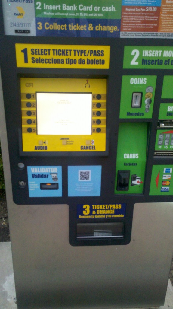
There’s my kiosk (enabling technology #1).

DART kiosk

It’s a friendly kiosk. Easy to use. It’s always done exactly what I wanted it to do. In fact, I’ve got it down to where I can execute my transaction in a matter of seconds now. Just what I want from a utilitarian kiosk.

But I noticed something different about it this morning. Something I’ve never noticed before.

DART kiosk with QR code

That’s right. A QR Code (enabling technology #2).

My kiosk just became a little bit more interesting. So I read (squinting – white type on light blue background is hard to read and I have pretty good eyesight) about what it offered.

DART QR Code

Learn more about using this kiosk.

Hmmmm.

So, let me step outside of myself – someone who knows a) how to make myself around most any type of interactive technology b) what QR codes are c) how to use them and most basically, d) how to use this kiosk – and get this straight. I walk up to a touch screen kiosk, something that might be a little bit confusing and intimidating, even if I’ve used an ATM before. And for the sake of this example, let’s just assume I get frustrated and don’t know how to make my way around it, I can now take out my smart phone and scan a QR Code to solve my problems?

Huh?

If I don’t feel comfortable using a basic kiosk, how in the world am I going to feel more comfortable scanning a QR Code on my smart phone to get a quick tutorial?

I. Don’t. Get. It.

Well, I had to scan the thing. So, I did. In scanning, I had to crouch down low enough to get a good shot of it. In doing so, caught the attention of everyone else walking by me, I’m sure, wondering, “what is he doing?!?! With his phone, taking a picture of that kiosk, bent all the way down like that?!?! Better him than me.”

I think this is a good lesson in placement. If you want people to use anything like this – any sort of code/image recognition – it’s best to put it in standing range. People feel much more comfortable being discreet when they are doing something that no one else around them is doing. Or rather, people don’t want to do anything extra to draw attention to themselves, especially if no one else is doing the same thing. Simply, don’t make them crouch or bend down or stand on their tippy toes to take the action.

Anyway, after scanning the code, I was led to a simple page with a video and social sharing features.

DART QR website
While ultra low-fi, I actually think their concept is pretty smart. If you strip everything away, their purpose is to give people more information about how accessible, easy, and versatile their kiosks are.

Noble. Useful. I’m assuming they spent quite a bit of money making enhancements to the new kiosks and they want everyone to know.

But is the best answer really to put a QR code on a low part of the kiosk?

And even more, to be vague about actually getting that information?

Jerry’s World and the Eensy-Weensy Touch Screen

I don’t know if there’s a single venue in the world that is more digitally turned on than the new Cowboys Stadium, er Jerry’s World. I was there last night for a concert. On our way, my wife asked me, “what are you most excited about – the concert or seeing the stadium?” I smiled. “Both,” I said. Nirvana.

You’d have to be living under a rock to not know about the JerryTron – the world’s largest high-definition display. Or the countless other displays and flashing lights that make it a mini Times Square capsule. Plopped right down in the middle of north Texas. It lives up to its hype, for sure. Especially for someone who notices and appreciates all of this digitalness.

But for all of the technology inside, I was initially surprised by the lack of interactive technology. I walked the entire stadium and while we didn’t explore every level, we got a good feel of all of the different kids of displays. And found only 1 example of interactive technology. This eensy-weensy touch screen in one of the Pro Shops (it was cordoned off last night):

Cowboys touch screen

It lets you make a personalized jersey. Quite appropriate and engaging, especially in the middle of a football game when the entire Pro Shop is filled with consumers. I can only assume this takes a little bit of the load off of the sales representatives and the consumers. Even if there’s only 1?!@?

Every other place I looked, I couldn’t find anything else that I could actually interact with. How could this be? Really, Jerry?

Then, I saw the drunk people. One after another, walking through the concourse. Stumbling in some cases. And I understood what kind of disaster anything highly interactive would be.

I think this is a great example of the importance of context.

Interactivity would, no doubt, enable some better experiences. Any time you can give people control of their own experience through technology, be it waiting in line, purchasing something, or consuming content, it’s generally the ideal to strive for. But when alcohol is present and alcohol – not any sort of technology – tends to be the primary element that enhances the experience, then I don’t necessarily think it’s such a great idea. Abuse. Grime. Who knows what else.

On the consumer/fan side – anyone in that state of mind and environment could probably care less about controlling their experience through any sort of technology like a touch screen. In fact, it might have the opposite affect on their experience –  it might be more challenging and/or frustrating. They’re just there to have a good time. It’s that simple. So, why do anything that a) could hamper that experience and/or b) is not really needed?

While it’s a simple point of context, I think it’s one that shouldn’t ever be overlooked. Alcohol is the X-factor. In many areas. Even in digital/interactive signage.

So, OK, I see – Jerry did it right again. The the smart solution is to provide 1 eensy-weensy touch screen in a cordoned off area of Technopolis. Nothing more.

Note – Now, interactivity through mobile phones is a completely different story, regardless of alcohol. Everyone was doing something on their mobile phone at some point during the concert. And most everyone I saw had a smartphone. (I didn’t pay close attention, but I certainly didn’t see any flip phones and I saw a lot of iPhones). Opening the digital displays up to user-generated content through their phones might not be the answer. But I think there is opportunity to engage consumers/fans in some way that enables interaction instead of just display. That’s for another post.

Another note – I’m not passing any judgement and/or making any assumptions about anyone’s ability to function with alcohol. This is based on personal experience and observation. Just saying….


The Evolution of OOH – Pt. 2

In my new exploration to try to find the 3.0 versions of OOH executions, I don’t think I’m going to have to search hard. They seem to be popping up every single day. The problem is in their scale. They’re typically one-off, experimental examples. Nonetheless, they deserve attention. This time, a billboard:

The 1.0 version

Billboards for Everyone 1.0

And the 3.0 version

Billboards for Everyone 3.0

An augmented-reality, GPS-based personal billboard that can be shared with your own social network. Instead of expressing your road-rage and/or road-delight expressions with cars and/or other drivers next to you, just hold up your phone, pick an emoticon and post it to your Facebook wall. (You can see more in the video below.)

This is a great example of how to make billboards interactive, but there are only a handful of places this would work. Somewhere where stop and go traffic, er gridlock, is the norm. Somewhere like NYC, right outside of the Holland Tunnel. Where this happens to be placed. So, they’ve got that working for them.

This has all of the characteristics of a 3.0 execution:

1. The experience – you can interact with the static billboard through your mobile phone. Just launch the AR application, point it at the billboard and the billboard will tell you how it feels and/or you can tell others how you feel, vis-a-vis the billboard.

2. Sharability – an interactive billboard like this is unique, so it’s more likely to drive a little bit more interest than normal. In a place like New York, it might drive a lot of interest. But aside from the interest, once people start to engage with the experience, sharing is at the center of it. What good is it to keep your emotions all pent up inside yourself? Especially in today’s hyperconnected world when everyone wants to share how they’re feeling, what they’re doing, and just generally, what they think of everything in the universe? Why not share how you’re feeling when sitting in traffic? Sounds reasonable to me.

3. Smart – traveling in and out of New York can be a bear. You can literally sit in one spot for an hour. While the message here is not groundbreaking, it does give travelers another way to express themselves, which everyone loves to do anyway. And to me, this is one of those smile things. When you engage in the experience, it can bring a smile to your face. Having sat in this particular place many times, before, after and/or during a busy New York day, I can say that smiles are not only good, they’re needed. Now, New Yorkers could care less about smiling or interacting with a silly billboard. But me, I like it.

4. Scalability – Billboard space is all over so we’ve got that going for the scalability of this execution. Smart phones will soon not be a barrier to something like this. A technology like augmented reality might. I still don’t know if the average consumer knows and/or cares to know about a technology like this. And if they do, how many times will the actually use it? If it unlocks experiences like this, perhaps it will increase interest and demand enough to break the barrier.

How many times would I engage with this billboard? After the first time, probably not too many. But what if most, if not all billboards could be personalized in an experience like this? It would completely change the way we interact with our surroundings. And that is the power of this new – 3.0 versioned – OOH space. It is inherently interactive. Not static. Not digital. Interactive.

Note – This unique billboard is part of the ADstruc’s ‘Billboards for Everyone’ campaign that partners with artists and designers to help promote creativity and innovation in the outdoor space. Very cool stuff. Check them out.