Category Archives: Digital Signage

Friday’s 4-1-1, Signs on My Morning Journey Style

I live in the country. No two ways about it. So, when I look around at all the (or lack of) technology in my everyday path out in the real world, on a daily basis, I’m certainly seeing the lite version. When I go closer to the city, or god forbid, in the city itself, it’s drastically different. Last month at SXSW in Austin, everywhere I turned there was a different technology, either displaying something in my face or enticing me to interact with it. And Austin, as a city, is completely different from Dallas as a city, as far as outdoor technology goes. I’m often actually amazed at how naked downtown Dallas is compared to other major cities like Austin or Chicago or NYC. Still, technology is all around us, everywhere we look, even in a naked city like Dallas, and even in the country where I live.

This morning, I stopped by every digital sign and interactive kiosk I noticed on my journey from my house to the train. And even though I live in a rural part of the country, I still encountered technology all along the way. Here’s that journey:

11th Screen | The Interactive Out of Home Blog

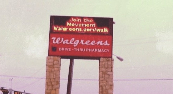
The sign outside the City Hall/Library, then the local Walgreens sign, then the Redbox outside its front doors, then the church’s sign, then the bank ATM, then the (boring) car wash clock, followed by the train ticket kiosk, then the train station sign, and finally, the sign inside the train. That’s the journey every morning.

So, I want to use today’s Friday 4-1-1 to reflect on the good, the bad, and the ugly of this technologically-fascinating & rich journey.

1. Snooze-fest – man, oh man, how boring can you get in terms of digital signage/interactive kiosks? These are the quintessential examples. The 1.o of both. And they’re all around because I mean, if they’re all the way out here in the country, they’re surely in the city, too. But you know what? I notice them because they’re….

2. Attention-getting – even if it is for a split second, I notice digital signs like these. Because they’re moving and/or colorful. Not for any other reason. Whereas it takes something more for me to notice a traditional billboard or poster – it usually has to stand out creatively. So, digital has that going for it. But the thing is – after I notice it, there are many times I instantly turn it off. If it’s not something and/or somewhere that interests me, I don’t care. So, in this regard (at least to  me), digital signage is more effective at getting eyeballs (awareness) to see more messages (reach), but not necessarily more effective at affecting consideration. Regardless, there is still an opportunity to drive consumers deeper into the brand through the sign…

3. As a connector – even boring signs like these have the ability to drive consumers deeper – at the very least, to a website. I’m amazed at how many of these signs that don’t do anything other than slam those (scrolling) messages right down our throat and pay no attention to the opportunity to do a little bit more. It’s ironic that whoever is making those decisions – like the one to install digital signage – is choosing not push the consumer farther down the brand experience path. I know it’s hard. But welcome to 2011.

4. Utility machines – yes, digital signage and kiosks like this are good for something. And it’s utility. Not experience. I talk a lot about always looking for ways to create an experience through channels/platforms like these, but it can’t, and shouldn’t, be done all the time. I do wonder what the 3.0 version of these will be, though.

“Duh” – technology makes delivering messages more efficient. That’s probably the most obvious thing I’ve ever said on this blog?!?! But here’s the thing – how fancy do you need to get when the only objective is to deliver more messages, more efficiently? Seems to me that there would be a couple of solutions out there in the market that could handle all of the different ways and scale to achieve this objective. As it is now, it seems like there are 100’s of solutions. Why?

“Uh-huh” – sometime in the (near) future, these signs will all be connected – to each other and to us. The Internet of Things, while futuristic and fantastical, is real and coming. If we don’t see a 3.0 version of these signs before then, well, I guess we will then. I wonder if network operators and the whoosits and whatsits in the industry understand?

Yes, my daily journey is low-fi, in terms of DOOH/IOOH. But I notice it all and on a level, appreciate it. For the most part, it serves its purpose.

What do you see on your regular daily activities? Is it anything like this?


Skittles Shows Us a Unique Way to Interact with Content

11th Screen | The Interactive Out-of-Home Blog

When I say touch screen, what do you think of?

Maybe your phone? Maybe the ATM? Maybe the self-check out at the grocery store? Heck, maybe even something like the Kohl’s kiosk?

When I think of touch screen, I think of all of these things. But boiling it down, I think of physically touching a screen to elicit an action. Whether it be for utility or experience, my finger becomes the mouse and guides my path through and experience. The experience is the thing. With expectations of fluidity in movement and functionality becoming higher and higher, it’s less about the touch and more about what it enables. The touch, though, is something that makes the experience instantly personal.

I have this thing about non-interactive digital signage and suffice it to say, I think any screen outside of the home not only has the ability to be made interactive, but it should be. Particularly digital screens. And that doesn’t just mean touch. How easy is it to include an SMS shortcode?

Well, Skittles might have just made the game a little bit easier. They’ve introduced a concept that I think all digital signage content producers should take note of: how to make content interactive via touch without a touch screen. See for yourself. And follow instructions – hold your finger there.

How simple, right?

So far, they’ve released 5 different videos and they’ve been pretty popular in a short amount of time (150K – 1.7M views). They’re short, (questionably) entertaining, and engaging. And that’s the key – they’re engaging.

Throw out all of the challenges like hardware and software – as far as digital signage goes – and you can really start to think about the reality of creating interactivity through a simple concept involving the type of content always running – video.

This is not the end-all solution for all those digital screens, but certainly for many of them within physical reach. There are many other factors to consider when deciding on the actual type of OOH/DOOH solution, I know. The thing is, for an industry that is so technology and advertising-centric – two debilitating constraints in pushing the limits – this is an example of how a basic piece of content, even in the form of an ad, can be manipulated to create engagement. How it can turn an otherwise static screen and message into something that deepens the brand experience and strengthens the relationship. And how creativity in storytelling can break down barriers that technology creates.

After all, it’s the content, not the technology that really drives true interactivity.


Macy’s Shows Us How to Think About (& Use) QR Codes

Macy's Backstage Pass QR Code

I have a love/hate relationship with QR codes.

On one hand, I love them because I think they’re a great enabling technology – a technology that bridges the offline world with the online, which is essential in driving any level of engagement when connecting with consumers outside of their homes. They’re efficient, convenient, and potentially rewarding. That is, they’re easy to use and they can unlock rich content.

In theory.

This is the hate side of the equation. Bad QR code executions are commonplace out there in the real world. Brands don’t know where to put them – should they go on TV or other digital screens or just be confined to print materials? Brands don’t know what content to put behind them – should they just unlock a website or an entry form or some sort of rich, multimedia content? But most of all, brands don’t seem to understand consumers’ awareness and comfort level with them – should they include instructions or an alternate way to access the information or just leave it to consumers to figure out how to use them? These are all general statements, I know. Yes, I have seen my fair share of quality code-based initiatives over the past 1.5 years, but they pale in comparison to the poor executions.

I believe now we’re seeing something that normally happens with any sort of technology that doesn’t wash out to the ocean of nothingness – on the consumer side, there is an awareness with what the technology is, and on the brand side, there is a drive to understand how best to use the technology to impact behavior. This adoption/impact wave is a long one. Right now, we’re just seeing brands actually understand how to best use social media to build relationships and impact consumer behavior. And social media (er, web 2.0) was introduced 5-6 years ago. That’s not to say QR codes will take 5-6 years to figure out, but adoption of technologies and new ways to utilize them do not happen overnight. They also require a fair amount of deliberate thought. They’ll hardly work if they’re just thrown out into the world for everyone to figure out.

This is what I’ve seen more often than not with QR codes.

So, it was refreshing to actually see a brand utilize traditional media channels in their marketing mix to raise awareness of their QR code campaign. A couple of weeks ago, I saw this Macy’s commercial on TV.

I did a double take. I had to rewind it to make sure I was seeing this right. A brand devoting a national TV spot to their QR code campaign? Brilliant.

I think the true brilliance is in the spot itself. It doesn’t just highlight the technology, it explains it. It explains what it is, where to look for it, how to use it, and most of all, what consumers can expect to get out of it. It also doesn’t limit this content to QR-code-only access. Have mobile phone? Can text? Then, not to worry, you can still experience this same content.

Now, when consumers go anywhere near Macy’s and see one of these pixilated stars, they at least have a better chance knowing what it is and what they can get out of it – two critical pieces needed to drive adoption and result in success.

And they’re not just focused on TV. They’re using many channels in their ecosystem to introduce, educate, and drive engagement with this star. Like on their Facebook page:

Macy's QR Code

On their windows:

Macy's QR Code

And of course, in their store:

Macy's QR Code

This, along print ads and even their staff wearing lanyards that explain what the program & code are, show how deliberate they want to be with this campaign.

Who knows if it will work? And more, who knows if QR codes, as a technology, will endure time and actually become adopted by the general consumer. In 5-6 years, we’ll know, right?

But this much is certain, and has endured over time – whoever reaches consumers at the right time with the right content will win.

The problem is – we’re living and consuming media in an evolving world, where consumers are on the go, out & about more than ever, technology is not the barrier it once was and everyone is connected. The rules have changed. Now, the right time to reach consumers is different for everyone. And it’s typically when they’re not in the confines of their homes.

Traditional broadcast channels like television are still great awareness channels, regardless of what you say about DVR. Non-traditional, emerging channels like Out-of-Home (OOH) and mobile are more and more becoming great engagement channels. Everything needs to work together. And Macy’s – much to their credit – has recognized this and is actually doing something about it.

I know the jury is still out on QR codes so I’d be interested to know if you think even a full-out marketing blitz like this will move the needle, in terms of QR code adoption and engagement? What do you think?

Out & About: DFW Airport Touch Screen Terminal Assistant

So there I was walking through Terminal D of the DFW Airport close to midnight and all I wanted to do is get to my car so I could go home. Then, out of the corner of my eye, I see this – another 11th Screen (IOOH) example – a large display that looked like it was just inviting a touch. So, of course, I stopped, got my trusty flip cam out, and started to poke around on it.

Let’s dust the scorecard off and put ‘er to the test.

Purpose – This is simply an interactive information kiosk that just happens to be an 80″+ touch screen. It’s designed solely to give travelers all of the essential information they need while they’re in the terminal – places to eat, where to shop, where to get your shoes shined, where the restrooms are, flight information – anything any traveler needs to know. Right at their fingertips. On an 80″+ touch screen. Mission accomplished.

Drama – When does an 80″+ touch screen not create a sense of drama? For the experience, I think it’s a bit like using a bazooka when you need a pea shooter. But the size is the thing that tipped me off to its interactivity. Ironically, I think it’s too well designed because the screen and structure fit right in to everything else in the terminal, so one could easily pass right by it thinking it’s just a big sign. And that’s the biggest problem. There was no clear call-to-action on the screen, nothing really that says, “hey there, why don’t you stop and touch this screen because I’ll give you some great information.” Instead, it’s just a silent 80″+ screen.

Usability – This is a simple experience so it’s usable. Or maybe it’s the other way around? In any case, this was an easy experience to navigate through. It wasn’t deep with content, so after you drill down a couple of times, you’ve hit the end of the path. But the GUI is laid out in a way that allows you to get to other pieces of content in a single press. As far as the functionality goes, I would underwhelmed with this experience. I wanted more and as you can see in the video, I expected it to function different than it actually did. With a large touch screen like this, I expect the functionality to be just as big. Not complex or obnoxious, but in some way commiserate with the size of the screen.

Interactivity – This is a single touch, single user touch screen experience. For a screen this big, they could have planned for multi-user interaction and created a rich experience. As it stands – in its current state – it’s as basic as you can get. The response and its functionality, after you press one of the buttons, is not distinct enough to let you know that something has happened. So, while the screen is responsive to your touch, the action (or seeming lack thereof) makes you think that it doesn’t work.

Information – To me, this succeeds at 1.0 information, but fails miserably at 2.0 information. Yes, it contains all of the information that it promises. But it’s base-level information – the name, the place, and the location. This experience could be made instantly better by integrating LBS (Foursquare, Gowalla) and/or consumer reviews/comments (Yelp?). Our friends at LocaModa would have a field day with this experience.

Personalization – There was no personalization in this experience. I think a social component – check-ins, reviews, comments – could add a welcome level of personalization to this. It would be relatively low user commitment, especially compared to the high level of benefit this sort of information would provide.

Overall, the lack of social integration has been a huge theme in these touch screen experiences over the last year. I am starting to feel like single-source information is not good enough anymore. But these are the things I pay attention to. I’m not sure that the average consumer – or traveler in this case – cares so much about it. Here’s the thing though – when their first impression includes social content, they feel like this is just another extension of what they’re used to when they use their computers or their phones. When it doesn’t include social content, I think we run the risk of not providing the type of value they need (based on their not-yet-completely-understood expectation).

More than that, though – when you’re going to do anything with an 80″+ touch screen, the experience better be 80″+.

Friday’s 4-1-1, Recapping DSE Style

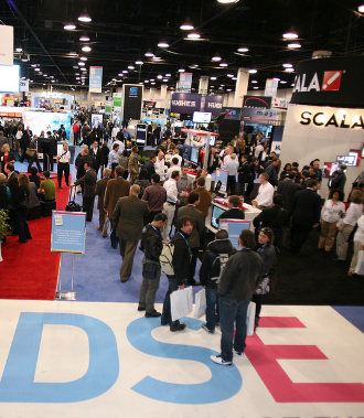
Digital Signage Expo Show Floor

A week removed from DSE and I’m head deep into preparing for SXSW (we support one of our clients – Chevrolet – for their SXSW Super Sponsorship). Next week, the activation that I’m leading kicks off as 10 teams from North America roadtrip down to Austin and document their journeys. The timing of DSE & SXSW presents many challenges for me, but it’s all about balance, right?

I’ve had time to reflect on my three days at DSE and now, I’m finding the time to document it. So, here you go, today’s Friday 4-1-1 is dedicated to my takeaways.

1. Non-digital signage player keynotes are goodShelly Palmer – someone who has nothing to do with digital signage – gave the keynote address. He spoke about how technology has changed our way of life (speed and scale) and loosely tied it to the digital signage industry. I thought it was refreshing, and even more, I thought it was important for the audience to hear someone a) removed from the industry and b) in tune with how consumers consume media and connect with each other through technology. He made a lot of great points and I really hope the majority of that audience walked out of the room as jazzed as I did. He was good. He doesn’t have a stake in the industry, per se, but certainly has a worthwhile perspective, given his knowledge and expertise. The nut of his presentation – technology is meaningless unless it changes the way we behave. I think it’s a great filter for everyone in the digital signage industry – does your solution change the way people behave? If not, what can you do to the solution to make it so?

2. The digital signage industry is not cutting edge in daily practice – This is definitely a general statement, but one of the questions that Shelly Palmer asked in his keynote was “how many of the audience has their information feeds set up through something like Google Reader?” And, at best, 10% of the audience raised their hands. I just find it ironic that an industry thought of as an emerging one does not apply some of the fundamental practices of the digital world. For those of you who don’t have feeds set up, Google Reader is a simple and effective tool. Go there, copy and paste your favorite URL’s and start getting all of that content in one single place. More than it being an aggregator for all of my favorite sites, I use it as a monitoring tool for trends and issues. For anyone who is creating a product that consumers will ultimately consume, it’s essential that you understand how they’re using like products and/or what they’re saying about them and/or who’s saying it. Google Reader is a great way to start understanding all of that information.

3. The “Content is King” talk is cheap – I can’t tell you how many times I heard “content is king” from different people. To everyone’s credit this year, I didn’t hear a peep of that last year. So, there is wide-spread recognition in the industry that content is important. But what’s new? Content is the thing. It always will be. For all of the talk about content, I didn’t see much of it from anyone on the showroom floor. Again, I’m left scratching my head. Nothing – in and out of this industry – is about technology. Technology is a means to an end and it can certainly change the way that we behave. But there is nothing more important than content. Never will be. So, can we all stop it with this phrase? It’s buzzed to the point of being laughable.

4. Relationships trump everything – I mean, if anything is the “king,” it’s relationships. Without relationships, nothing is sustainable. I am so thankful for all of the relationships I’ve been able to form in this industry. It’s filled with great people. To me, the best thing about DSE was connecting and re-connecting with those I know and met for the first time. Way better than any session and/or anything I saw on the showroom floor. If you want to focus on one thing at a conference like this, you can’t go wrong with focusing on the people. All else pales in comparison.

“Uh-huh” – The show organizers are great. Thank you, again, to Gerri. I will forever be grateful to you. Angelo and Chris – thank-you as well. And to those sweet, stand-your-ground hosts of the blogger lounge – you rock.

“Duh”My golf game needs a little bit of help. I didn’t do bad for not playing in 2 years. But, if they do it again next year, and my team accepts me back, I’ll play a couple of practice rounds before-hand.

All in all, it was a great show. I saw lots of improvements over last year. They’re really trying to put the focus on content and interactivity and pull new people in to this. They’ve done a great job with their approach to education throughout the year, and you could feel it at the show. There’s a fairly long road to go, but they’ve got great minds trying to push this into something that is attractive and valuable for everyone outside of the industry.

Thanks, as always, for reading. Happy weekend!


Are Consumers Blind to Place-Based Digital Signage?

11th Screen | The Interactive Out-of-Home Blog

The more I reflect on my time at DSE last week, the more rich I feel it was. And the funny thing about it is, I didn’t spend my time racing around seeing everything under the sun. I focused on a couple of activities and spent the rest of the time meeting & talking to people. There are some incredible minds in the digital signage industry. That much is for sure.

One of the richer times I had and that I wrote about last week was my dinner with Dave and Pat from Preset. It was really an interesting discussion – I was able to hear from them more than surface thoughts on important concepts that this industry wrestles with. In a lot of ways, it was kinda like a master class for me. You ever have those times when you find yourself in a situation where you’re like, holy crap, there’s some serious knowledge here? Well, that was me then.

One of the things we talked about was this idea of screen blindness. It’s an idea that I’ve thought about for awhile now. The question is – is the average consumer blind to outdoor screens? (And I’m not talking about Times Square or the strip in Vegas. I’m talking about standard outdoor screens like in elevators or in lobbies or at the gas station.) They’re everywhere now, so when someone encounters a screen, how much do they pay attention to it? Or better yet, how much do they even notice it?

I would say (and I did that night) that the answer is a) yes, generally consumers are blind to the screens, b) they don’t pay much attention to them and better yet c) they notice them less and less.

The reason? Mainly content and lack of interaction. Over time.

I think these digital screens have been around long enough with bad content that the average consumer perceives them as delivering little value. There are, of course, exceptions to this statement, but overall, most of these screens seem to be filled with advertisements, boring/useless content loops and/or some sort of broadcast news. They’re push-only devices delivering content that is completely un-engaging, un-inspiring, and most of all, something any one of us could experience on our own personal mobile devices.

And it’s been this way for years. Literally.

So, why pay attention to them?

I think this is a serious question that everyone who is trying to reach and engage consumers outside of the home, through these digital screens, must answer.

I don’t think the answer is because it reaches them at the right place and the right time. That, to me, is a given, and sure there’s value in that – reaching someone when they’re closer to the point of sale. Giving them a pertinent message while they’re in a waiting in a doctor’s office. But I think people been reached in the right place at the right time in so many un-effective ways, over time, that they see less and less value with these screens and are becoming blind to them.

Next time you’re in the presence with someone, outside of the home, in the vicinity of a digital screen, watch them. Do they watch what’s on the screen? If so, are they watching because they’re engaged? Or are they watching because it’s a distraction and something to pass the time?

Place-based digital signs, in order to be truly effective and valued, cannot be viewed as simply good at distracting people.

They have to do more. They have to deliver good, relevant content and more and more, in order to re-see them, to associate them with value, they have to engage consumers in some way.

So, that’s what I think. What do YOU think? Would love to hear your thoughts!

Supplier Spotlight – NanoLumens

I usually don’t get excited about any sort of digital signage hardware, but that changed when I stopped by the NanoLumens booth at DSE. Upon first glance, it was just another huge screen, displaying high-definition video & images. Cool, but nothing too special (at least for me – I mean, I kind of expect big displays out of digital signage, especially at a tradeshow).

How I was wrong.

The size isn’t really what makes this solution special, although it is one of its selling points (more on that in a bit). What really makes it special is its weight and flexibility. That’s right – flexibility. That big screen bends.

I immediately thought of Esquire’s e-ink cover in 2008 on steroids. But although the Esquire cover was novel, it was completely underwhelming. This NanoLumens display is anything but. It’s quite awesome, actually. It really puts into perspective what’s possible, on this scale, in terms of flexibility.

The sign is a mosaic of LED-powered squares and it’s those squares (7”x3.5”) that give it the pliability it needs to fit on convex and concave surfaces. The fact that it conforms to these surfaces and actually looks like it’s part of the environment is a huge benefit, in my opinion. The more something looks like it was meant to be there, the more attention it will get. And the screen is such that if you want to put it on a boring flat surface, it can easily fit there, too.

Easily is the operative word. Another key benefit to this screen is its light weight. They had this 100+” screen in their booth on a swivel mount and the ease in which they turned the screen – a true reflection of its weight – was remarkable. It was effortless. The real-world benefit of this can’t be overlooked. Imagine hanging one of these huge screens on any surface, high above the ground vs. a standard 100+” screen – not having done this, I can only image that the strain and equipment to actually do that would easily be cut in half by this NanoLumens display.

See how thin it is, too? (that’s taken from the side)

And Its design – those small squares – also allow it to be customized to any size and shape. Circle, square, triangle – doesn’t matter. They can do it.

If all that weren’t enough, here’s some more (taken off their website). The displays are:

  • Robust and durable – they’re sealed and fanless, waterproof and dustproof;
  • And energy-conscious – drawing about the same power as a coffee-maker.

And they couldn’t have nicer guys on the front lines, telling people about this product. Great product + good people = success.

This is truly NOT a one-size-fits-all sign, in every possible aspect.

My Debut on Cohen on Content

11th Screen | The Interactive Out-of-Home Blog

I had a chance to meet Phil Cohen at DSE and sat down with him for one of his Cohen on Content interviews. Here is mine.

I don’t think I did a great job of explaining the convergence of “out-of-home” and content with my current agency. Since I work for a PR firm – although I think it’s the most progressive, digitally-saavy PR firm in the world – we don’t deal with traditional “digital” out-of-home and certainly not with networks. But where I’ve found incredible opportunity, particularly with the proliferation of mobile devices, is being able to turn on the things around us (cars, posters, etc.), that we use in events that we concept and support. We take a very grassroots approach to interactive out-of-home.

And the story that I was going to tell was how we basically turned a car (a thing in the real-world) into a virtual scrapbook that allowed everyone who came into contact with it to not only consume content, but create and add their own content to it. In today’s social world, brands don’t need to create all of the content themselves. Consumers are creating content themselves and sharing with their networks. This is a treasure trove of content that brands can tap into.

For anyone putting together a content and/or engagement strategy, regardless of channel/screen, consider social content. It is powerful, effective, and for the most part, free.

Aside from that, I just wish someone would have told me to look at the camera more.

DSE Session 2 – Using Interactive Technology to Lift Sales & Drive Revenue

11th Screen | The Interactive Out-of-Home Blog

Robert Ventresca (NCR), Jordan Scott Baltimore (Oyster Digital Media Corp.)

Robert’s up 1st – What is interactive technology?  Interactive covers wide range of techs used in the world today.

For today’s discussion, they’re going to focus on in-store.

Blurring of terminology is increasing rapidly.

What’s driving adoption of interactive?

  • Multi-channel synchronization. Wow, what a word.
  • Automating routine activities (this is very much a utility use/benefit – hmmm).
  • Empower customers and employees – this is the only thing they’ve talked about that even resembles/eludes to experience.
  • Enhance the consumer experience – there you go (just wasn’t on the slide)

17-month Wharton study of 500 retail stores – 4 key drives of customer satisfaction:

  1. Availability of product information
  2. Source of information helpful
  3. Customer perception of product availability
  4. Checkout line waits

Interactivity = self-service. He’s caveating that statement. Understand. Interesting that he’s coming at it from a utility-first POV. Can just tell in his approach.

Key components of interactive projects:

  • Infrastructure (hardware, installation)
  • Software
  • Content

“Content is king” – everyone has said this today. I can’t tell you how many times I’ve heard it. He’s making the point that all 3 – infrastructure, software & content – are king. Can we just say the king is dead now?

This is a very systematic approach to “interactive.”

Jordan now – challenge the 3 king/content king thing. “The customer is the king.” – Amen, brother, amen.

These are the guys behind the Samsung Experience. They approached it as – If I was a customer in this experience, what would I really be blown away by? They also wanted to support the brand ambassadors (sales reps), too. Not replace them.

He’s saying all the things that align with my thinking – not talking to the consumers, it’s talking with the consumers. It’s not a 1-way communication, it’s a 2-way communication. It can and should be measured.

Just talking, talking, talking – show us the pictures, or a video, show me this baby, Jordan!

Interactive technology should complement and enhance traditional engagement.

How can we use interactive technology to get consumers involved? How can you make a consumer make a better decision at the point of sale? Good questions.

Start with the consumers. That simple.

Oyter’s Retail Experience Platform: Relevant, Interactive, Intelligent, Integrated.

This is a good session for this audience to hear. I just wish it were more compelling. Photos. Videos. Something that has a wow factor. Just wasn’t there.

Nut – Interactivity is good. It’s effective. Think about implementing it. Start with the consumer, not the technology.

Word of the session – Multi-channel synchronization.